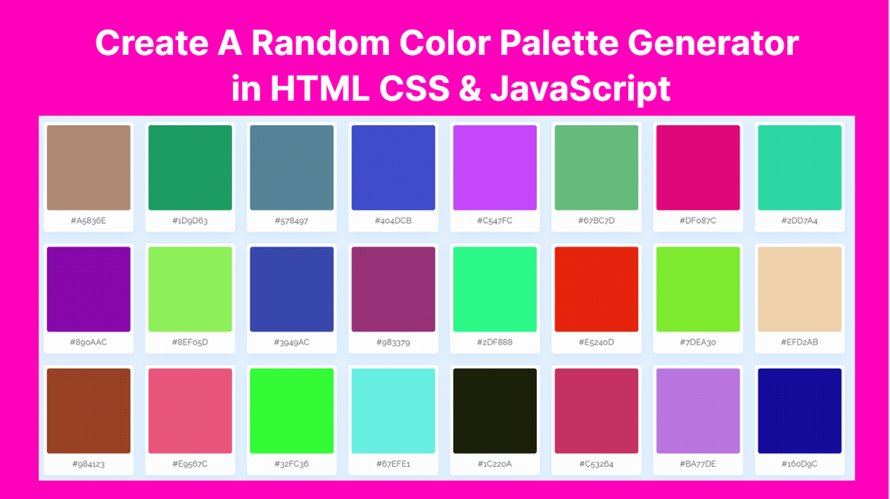
A color palette is a collection of colors that are used together in a design or artwork. In web design, a color palette is a set of colors that are chosen to be used consistently throughout a website, to create a cohesive and visually pleasing look and feel.
Using a color palette in web design is beneficial for several reasons:
- Consistency: By using a consistent set of colors throughout a website, designers can create a sense of coherence and organization. This can help to improve the user experience, as users can quickly and easily navigate the site.
- Branding: A color palette can be used to reinforce a brand’s visual identity, by incorporating the brand’s colors into the website design. This can help to create a strong and memorable brand image.
- Accessibility: Using a carefully chosen color palette can help to ensure that the website is accessible to all users, including those with color vision deficiencies. By using colors that have a high contrast and are easy to distinguish, designers can create a website that is easy to read and navigate.
- Aesthetic appeal: A well-designed color palette can help to create a visually appealing website that is engaging and attractive to users. This can help to improve the overall user experience, and encourage users to spend more time on the site.
Overall, a color palette is an essential tool for web designers, as it can help to create a cohesive and visually appealing website that is easy to use and accessible to all users.
Here is a basic HTML, CSS, and JavaScript boilerplate template to get you started:
<!DOCTYPE html>
<html>
  <head>
    <title>My Website</title>
    <meta name="viewport" content="width=device-width, initial-scale=1.0">
    <link rel="stylesheet" href="style.css">
  </head>
  <body>
    <h1>Hello, World!</h1>

    <script src="script.js"></script>
  </body>
</html>
Add the following code in body section.
 <ul class="container">
        <li class="color">
            <div class="rect-box"></div>
            <span class="hex-value">#8A6CFF</span>
        </li>
</ul>
<ul class="container">– This is an unordered list (UL) element with a class of “container”. This element is used to group a set of list items (LI) together.<li class="color">– This is a list item (LI) element with a class of “color”. This element represents each color in the color palette. We can have multiple LI elements to represent multiple colors.<div class="rect-box"></div>– This is a div element with a class of “rect-box”. This element represents the color box in the color palette. We can use CSS to style this box with a specific background color to represent the color in the palette.<span class="hex-value">#8A6CFF</span>– This is a span element with a class of “hex-value”. This element represents the hexadecimal value of the color in the palette. We can use JavaScript or server-side programming to generate the hexadecimal value for each color and insert it into this span element.
<button class="refresh-btn">Refresh Palette</button>
This is a code snippet for a button element with a class of “refresh-btn”. This button is commonly used in web applications to refresh or reload content dynamically without having to refresh the entire page.
Finally HTML displays as follows.
<ul class="container">
        <!-- <li class="color">
            <div class="rect-box"></div>
            <span class="hex-value">#8A6CFF</span>
        </li>
</ul>
<button class="refresh-btn">Refresh Palette</button>
Open the css file and add following code as follows
<link href="https://fonts.googleapis.com/css?family=Lato|Nanum+Gothic:500|Raleway&display=swap" rel="stylesheet">
This is a code snippet for adding external fonts to a web page using the Google Fonts API. Google Fonts is a popular service that provides a wide range of free web fonts that can be used in web design.
Here’s how to use this code snippet to add external fonts to your web page:
- Copy and paste the code snippet into the head section of your HTML document, preferably before any other CSS stylesheets or scripts:
- In the
hrefattribute of thelinkelement, specify the URL of the Google Fonts API, followed by a list of font families that you want to use on your web page. In this example, we are using three font families: Lato, Nanum Gothic, and Raleway. - You can use the font family names in your CSS styles to apply the desired font to your HTML elements.
* {
            margin: 0;
            padding: 0;
            box-sizing: border-box;
            font-family: raleway;
        }
This is a CSS code snippet that applies to all HTML elements on a web page. It sets some common styles for all elements to ensure consistency in the layout and design of the page.
Here’s a breakdown of what each style does:
margin: 0: This sets the margin property of all HTML elements to 0. This removes any default margin that may be applied to elements by the browser, which can help ensure consistent spacing and layout across different devices and browsers.padding: 0: This sets the padding property of all HTML elements to 0. Like margin, this removes any default padding that may be applied by the browser, ensuring consistent spacing and layout.box-sizing: border-box;: This sets the box-sizing property of all HTML elements to border-box. This ensures that the width and height of an element includes any padding or border that may be applied to it. This can help prevent layout issues that can occur when padding or border is added to an element.font-family: raleway;: This sets the font-family property of all HTML elements to “raleway”. This specifies the font family that should be used for all text on the page. In this case, “raleway” is the font family being used, but you can substitute it with any font family that you prefer.
Overall, this code snippet provides a good starting point for building a web page with consistent layout and design, and it can help save time by eliminating the need to specify these styles individually for each element.
body {
            background: #E3F2FD;
        }
This is a CSS code snippet that sets the background color of the body element of an HTML document.
Here’s a breakdown of what each style does:
body: This selects the body element of the HTML document. The body element represents the main content area of the page.background: #E3F2FD;: This sets the background color of the body element to the specified color code, which is a light blue color (#E3F2FD). This will set the background color of the entire page to the specified color.
.container {
           display: flex;
           flex-wrap: wrap;
           margin: 20px;
           justify-content: center;
       }
related to the layout and positioning of its child elements. Let’s break down each of these properties in more detail:
display: flex;: This property sets the container to use flexbox layout. Flexbox is a powerful layout model that allows you to control the alignment, distribution, and order of elements within a container. Once you set an element to display: flex, its child elements become “flex items” that can be positioned and sized using various flexbox properties.flex-wrap: wrap;: This property specifies how flex items should wrap when they exceed the width of the container. In this case, the value “wrap” indicates that flex items should wrap onto the next line if they can’t fit horizontally within the container. Without this property, flex items would continue to expand horizontally and potentially overflow the container.margin: 20px;: This property sets the margin around the container. The value “20px” indicates that there should be a 20-pixel margin on all sides of the container. This can help to create visual separation between the container and other elements on the page.justify-content: center;: This property controls the horizontal alignment of flex items within the container. The value “center” indicates that flex items should be centered along the main axis of the container. The main axis is determined by the flex-direction property, which is set to “row” by default (meaning that flex items are laid out horizontally from left to right).
So, in summary, the CSS code you provided sets up a container element that uses flexbox layout, wraps flex items onto multiple lines as needed, applies a 20-pixel margin around the container, and centers flex items horizontally within the container. This is a common pattern for creating flexible, responsive layouts that adjust to different screen sizes and content lengths.
.container .color {
           background: #FFf;
           list-style: none;
           margin: 13px;
           padding: 7px;
           border-radius: 6px;
           text-align: center;
           cursor: pointer;
           box-shadow: 0 10px 20px rgba(52, 87, 220, 0.08);
           transition: transform 0.3s ease;
       }
The CSS code you provided targets a specific element within a container element and specifies several properties related to its appearance and behavior. Let’s break down each of these properties in more detail:
.container .color: This is a selector that targets all elements with the class “color” that are descendants of an element with the class “container”. This allows you to apply styles to specific elements within a container without affecting other elements on the page.background: #FFf;: This property sets the background color of the element to a light shade of white (#FFF). The background color is the color that fills the content and padding areas of an element.list-style: none;: This property removes the default bullet point or numbering from the element. This is useful for elements that are not lists, such as buttons or divs.margin: 13px;: This property sets the margin around the element. The value “13px” indicates that there should be a 13-pixel margin on all sides of the element. Margins create space around an element and can be used to control the layout of elements on the page.padding: 7px;: This property sets the padding within the element. The value “7px” indicates that there should be a 7-pixel padding on all sides of the element. Padding creates space within an element and can be used to separate content from the element’s border or background.border-radius: 6px;: This property sets the radius of the element’s border corners to 6 pixels. This creates a rounded appearance for the element’s corners.text-align: center;: This property centers the text content of the element horizontally. This is useful for elements such as buttons or headings that contain text.cursor: pointer;: This property changes the cursor style to a pointer when the user hovers over the element. This gives the user visual feedback that the element is clickable or interactive.box-shadow: 0 10px 20px rgba(52, 87, 220, 0.08);: This property adds a box-shadow to the element. The values “0 10px 20px” indicate that the shadow should be positioned directly below the element, with a blur radius of 20 pixels and a spread radius of 10 pixels. The last value, “rgba(52, 87, 220, 0.08)”, sets the color and opacity of the shadow. Box shadows can be used to add depth and dimension to an element.transition: transform 0.3s ease;: This property specifies a transition effect for the element. The value “transform” indicates that the transition should apply to the transform property (which controls transformations such as scaling or rotating an element). The value “0.3s” specifies the duration of the transition, and the value “ease” specifies the timing function for the transition. This creates a smooth, animated effect when the element is transformed.
So, in summary, the CSS code you provided sets up a specific element within a container with a light background color, no list-style, a margin and padding of 13 and 7 pixels respectively, rounded corners, centered text, a pointer cursor, a box-shadow with a blue color, and a smooth transition effect when transformed. This creates a visually appealing and interactive element that is consistent with other elements within the container.
.container .color:active {
            transform: scale(0.95);
        }
This CSS code targets the same element with the class “color” that we discussed earlier, but specifically applies a style when the element is in an “active” state. The “active” state refers to the moment when the element is clicked or touched by the user.
The code sets the “transform” property to “scale(0.95)”, which scales the element down to 95% of its original size. This creates a visual feedback that the element is being interacted with, as it appears to shrink slightly when clicked.
The “transform” property is a CSS property that allows you to apply 2D or 3D transformations to an element, such as scaling, rotating, or translating it. In this case, the “scale” function is used to scale the element down by a factor of 0.95, which reduces its size slightly.
Overall, this CSS code creates an interactive effect for the element when it is clicked, making it more engaging and responsive to user input.
.color .rect-box {
            width: 185px;
            height: 188px;
            background: #8A6CFF;
            border-radius: 5px;
        }
This CSS code targets a child element of the element with the class “color” that we discussed earlier, specifically one with the class “rect-box”. It applies several styles to this element:
width: 185px;: This property sets the width of the element to 185 pixels. This controls the horizontal size of the element.height: 188px;: This property sets the height of the element to 188 pixels. This controls the vertical size of the element.background: #8A6CFF;: This property sets the background color of the element to a shade of purple (#8A6CFF). This creates a colored rectangle within the element.border-radius: 5px;: This property sets the radius of the element’s border corners to 5 pixels. This creates a slightly rounded appearance for the corners of the rectangle.
Overall, this CSS code creates a rectangular box within the element with the class “color”. The box has a specific width, height, and background color, and slightly rounded corners. This box can be used to display additional content or elements within the main element, such as text, images, or icons.