Lists are important in web development for several reasons:
- Structuring content: Lists provide a clear structure to content, making it easier for users to read and understand. They can be used to organize information into categories, subcategories, and bullet points, making the content more scannable and accessible.
- Styling and formatting: Lists can be styled and formatted in various ways to improve the overall design and user experience. Web developers can choose from a variety of list styles, such as unordered lists (bullets) and ordered lists (numbered), as well as customize the spacing, font, color, and other visual elements.
- Accessibility: Lists are essential for making websites accessible to all users, including those who use assistive technologies such as screen readers. Screen readers rely on properly formatted lists to convey the content in a meaningful way.
- SEO: Lists can also help improve the search engine optimization (SEO) of a website. Search engines often use lists as a way to identify key points and topics on a webpage, which can improve the page’s ranking in search results.
Overall, lists are an essential element of web development and can greatly enhance the usability, accessibility, and visual appeal of a website.
In HTML and CSS, a hover effect is a visual change that occurs when a user hovers over an element with their cursor. Hover effects can be applied to a wide range of HTML elements, including text, images, buttons, and links. Hover effects are commonly used to provide visual feedback to the user, such as highlighting a button or changing the color of a link.
Here’s a basic boilerplate code for HTML, CSS, and JavaScript:
<!DOCTYPE html>
<html>
  <head>
    <meta charset="UTF-8">
    <title>My Webpage</title>
    <link rel="stylesheet" href="style.css">
  </head>
  <body>
    <h1>Hello, World!</h1>
    <script src="script.js"></script>
  </body>
</html>
Open html file and add following code
 <section>
        <div class="box">
            <h3>Popular Creater List</h3>
        </div>
</section>
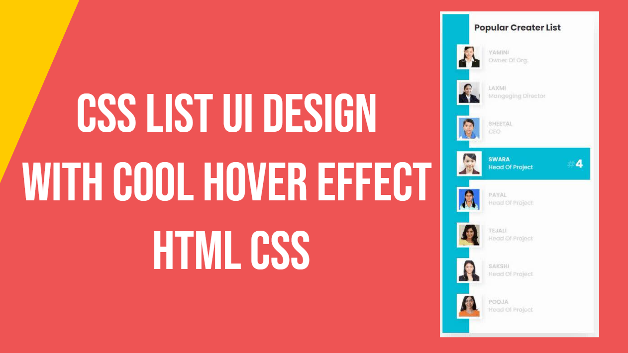
This code creates a section element with a class of “box” that contains a heading element (h3) with the text “Popular Creator List”. The section element is a semantic HTML element that can be used to define a section of a webpage. The div element with the class of “box” is used to create a container for the heading and can be styled using CSS to create a visual effect.
<div class="list">
                <div class="imgBx">
                    <img src="student/1.jpg">
                </div>
                <div class="content">
                    <h2 class="rank"><small>#</small>1</h2>
                    <h4>Yamini</h4>
                    <p>Owner Of Org.</p>
                </div>
            </div>
Here’s a breakdown of each element and its purpose:
<div class="list">: This creates a container element for the entire list item.<div class="imgBx">: This creates a container element for the image. The image is placed inside this container using the<img>tag.<img src="student/1.jpg">: This is an<img>tag that loads the image file “1.jpg” from a directory named “student”.<div class="content">: This creates a container element for the content, which includes the heading and paragraph text.<h2 class="rank"><small>#</small>1</h2>: This creates a heading element (h2) with a class of “rank”. The small tag with “#” creates a small text in the top left corner of the heading to represent a rank or order. In this case, the rank is “1”.<h4>Yamini</h4>: This creates a heading element (h4) with the name “Yamini”.<p>Owner Of Org.</p>: This creates a paragraph element with the text “Owner Of Org.”.
Overall, this code creates a simple list item with an image, a rank number, a name, and a description. It can be repeated multiple times to create a list of items, or modified to fit different content and design requirements.
Finally Our html file look like this
<section>
       <div class="box">
           <h3>Popular Creater List</h3>
           <div class="list">
               <div class="imgBx">
                   <img src="student/1.jpg">
               </div>
               <div class="content">
                   <h2 class="rank"><small>#</small>1</h2>
                   <h4>Yamini</h4>
                   <p>Owner Of Org.</p>
               </div>
           </div>
           <div class="list">
               <div class="imgBx">
                   <img src="student/2.jpg">
               </div>
               <div class="content">
                   <h2 class="rank"><small>#</small>2</h2>
                   <h4>Laxmi</h4>
                   <p>Mangeging Director</p>
               </div>
           </div>
           <div class="list">
               <div class="imgBx">
                   <img src="student/3.jpg">
               </div>
               <div class="content">
                   <h2 class="rank"><small>#</small>3</h2>
                   <h4>Sheetal</h4>
                   <p>CEO</p>
               </div>
           </div>
           <div class="list">
               <div class="imgBx">
                   <img src="student/4.jpg">
               </div>
               <div class="content">
                   <h2 class="rank"><small>#</small>4</h2>
                   <h4>Swara</h4>
                   <p>Head Of Project</p>
               </div>
           </div>
           <div class="list">
               <div class="imgBx">
                   <img src="student/6.jpg">
               </div>
               <div class="content">
                   <h2 class="rank"><small>#</small>5</h2>
                   <h4>Payal</h4>
                   <p>Head Of Project</p>
               </div>
           </div>
           <div class="list">
               <div class="imgBx">
                   <img src="student/8.jpg">
               </div>
               <div class="content">
                   <h2 class="rank"><small>#</small>6</h2>
                   <h4>Tejali</h4>
                   <p>Head Of Project</p>
               </div>
           </div>
           <div class="list">
               <div class="imgBx">
                   <img src="student/11.jpg">
               </div>
               <div class="content">
                   <h2 class="rank"><small>#</small>7</h2>
                   <h4>Sakshi</h4>
                   <p>Head Of Project</p>
               </div>
           </div>
           <div class="list">
               <div class="imgBx">
                   <img src="student/12.jpg">
               </div>
               <div class="content">
                   <h2 class="rank"><small>#</small>8</h2>
                   <h4>Pooja</h4>
                   <p>Head Of Project</p>
               </div>
           </div>
       </div>
   </section>
Now open css file for styling
* {
            margin: 0;
            padding: 0;
            box-sizing: border-box;
            font-family: 'Poppins', sans-serif;
        }
This is a CSS code that sets the default styles for all elements in a webpage. Here’s a breakdown of each property:
margin: 0;: This sets the margin of all elements to 0. The margin is the space outside an element’s border.padding: 0;: This sets the padding of all elements to 0. The padding is the space inside an element’s border.box-sizing: border-box;: This sets the box-sizing property to border-box for all elements. This means that the width and height of an element includes its padding and border, but not its margin.font-family: 'Poppins', sans-serif;: This sets the font-family property to ‘Poppins’, a popular sans-serif font. If the font is not available, the browser will use a default sans-serif font.
By setting these default styles, the code ensures that all elements have a consistent appearance and layout. This can save time and effort when designing and coding a webpage, as it eliminates the need to specify these styles for every individual element.
body {
           display: flex;
           justify-content: center;
           align-items: center;
           min-height: 100vh;
           background: #fcfcfc;
       }
This is a CSS code that styles the body element of a webpage. Here’s a breakdown of each property:
display: flex;: This sets the display property of the body element to flex. This enables flexbox layout for the body element and its child elements.justify-content: center;: This centers the child elements of the body element horizontally along the main axis. In this case, the main axis is the horizontal axis.align-items: center;: This centers the child elements of the body element vertically along the cross axis. In this case, the cross axis is the vertical axis.min-height: 100vh;: This sets the minimum height of the body element to 100 viewport height units. The viewport height is the height of the browser window. This ensures that the body element is at least as tall as the browser window.background: #fcfcfc;: This sets the background color of the body element to #fcfcfc, a light gray color.
By using flexbox layout, the code centers the content of the webpage both horizontally and vertically, making it more visually appealing and easier to read. The minimum height property ensures that the content takes up the full height of the browser window, while the background color property sets the background color to a neutral gray that doesn’t distract from the content.
.box {
            position: relative;
            min-width: 425px;
            background: #00bcd4;
            padding: 20px;
            box-shadow: 0 35px 50px rgba(0, 0, 0, 0.1);
        }
This is a CSS code that styles an element with the class name “box”. Here’s a breakdown of each property:
position: relative;: This sets the position property of the element to relative. This enables the element to be positioned relative to its normal position in the document flow.min-width: 425px;: This sets the minimum width of the element to 425 pixels. This ensures that the element is wide enough to display its content without wrapping to the next line.background: #00bcd4;: This sets the background color of the element to #00bcd4, a shade of blue.padding: 20px;: This adds 20 pixels of padding to the top, right, bottom, and left sides of the element. Padding is the space between an element’s content and its border.box-shadow: 0 35px 50px rgba(0, 0, 0, 0.1);: This adds a box shadow to the element. The shadow is positioned 0 pixels from the left, 35 pixels from the top, and has a spread of 50 pixels. The color of the shadow is rgba(0, 0, 0, 0.1), which is a black color with 10% opacity.
By using these properties, the code creates a box with a blue background, white text, and a box shadow that gives it a 3D effect. The minimum width property ensures that the box is wide enough to display its content, while the padding property adds space between the content and the border of the box. The relative position property enables the box to be positioned relative to its normal position in the document flow.
.box::before {
            content: '';
            position: absolute;
            top: 0;
            right: 0;
            width: calc(100% - 75px);
            height: 100%;
            background: #fff;
        }
This is a CSS code that styles a pseudo-element ::before of an element with the class name “box”. Here’s a breakdown of each property:
content: '';: This sets the content property of the pseudo-element to an empty string. This is required for pseudo-elements to work properly.position: absolute;: This sets the position property of the pseudo-element to absolute. This enables the pseudo-element to be positioned relative to its nearest positioned ancestor, which is the .box element in this case.top: 0;: This sets the top position of the pseudo-element to 0 pixels. This positions the pseudo-element at the top of the .box element.right: 0;: This sets the right position of the pseudo-element to 0 pixels. This positions the pseudo-element at the right edge of the .box element.width: calc(100% - 75px);: This sets the width of the pseudo-element to 100% of the width of the .box element, minus 75 pixels. This creates a white overlay that covers most of the .box element, leaving a 75-pixel-wide strip on the right side.height: 100%;: This sets the height of the pseudo-element to 100% of the height of the .box element. This ensures that the pseudo-element covers the entire height of the .box element.background: #fff;: This sets the background color of the pseudo-element to white.
By using a pseudo-element with a white background, the code creates a white overlay that covers most of the .box element, leaving a 75-pixel-wide strip on the right side. This effect adds depth and visual interest to the .box element, making it stand out from other elements on the page.
.box h3 {
            position: relative;
            color: #333;
            font-size: 1.5rem;
            margin-bottom: 20px;
            padding-left: 70px;
        }
This is a CSS code that styles the h3 element that is a child of an element with the class name “box”. Here’s a breakdown of each property:
position: relative;: This sets the position property of theh3element to relative. This allows other properties liketop,bottom,left, andrightto be used to position the element.color: #333;: This sets the text color of theh3element to a dark gray color.font-size: 1.5rem;: This sets the font size of theh3element to 1.5 times the default font size.margin-bottom: 20px;: This sets the bottom margin of theh3element to 20 pixels. This creates space between theh3element and any elements that follow it.padding-left: 70px;: This sets the left padding of theh3element to 70 pixels. This creates space between the text of theh3element and the left edge of the box element.
By using a relative position and padding-left, the text of the h3 element is pushed to the right by 70 pixels, creating space between the text and the left edge of the box element. The bottom margin creates space between the h3 element and any elements that follow it. The dark gray text color and increased font size help the heading stand out and draw attention to the content inside the box.
.box .list {
            position: relative;
            display: flex;
            align-items: center;
            padding: 10px;
            margin: 10px 0;
            cursor: pointer;
        }
This is a CSS code that styles the elements that have both the classes “box” and “list”. Here’s a breakdown of each property:
position: relative;: This sets the position property of the.listelement to relative. This allows other properties liketop,bottom,left, andrightto be used to position the element.display: flex;: This sets the display property of the.listelement to flex. This makes the element a flex container, allowing its child elements to be flex items.align-items: center;: This sets the vertical alignment of the flex items to center. This centers the child elements vertically within the.listelement.padding: 10px;: This sets the padding of the.listelement to 10 pixels on all sides. This creates space between the child elements and the edges of the.listelement.margin: 10px 0;: This sets the margin of the.listelement to 10 pixels on the top and bottom, and 0 pixels on the left and right. This creates space between.listelements.cursor: pointer;: This sets the cursor property of the.listelement to pointer. This changes the mouse cursor to a hand pointer when the element is hovered over, indicating that it can be clicked or interacted with.
By using a relative position and flexbox, the child elements of .list are aligned vertically and centered within the .list element. The padding and margin properties create space between .list elements and their child elements. The cursor property indicates that .list elements are interactive and can be clicked.
.box .list::before {
            content: '';
            position: absolute;
            width: 100%;
            height: 100%;
            background: #00bcd4;
            transition: transform 0.5s;
            transform: scaleX(0);
            transform-origin: right;
        }
This is a CSS code that styles the pseudo-element ::before for elements that have both the classes “box” and “list”. Here’s a breakdown of each property:
content: '';: This sets the content of the pseudo-element to an empty string. This is necessary for the pseudo-element to be displayed.position: absolute;: This sets the position property of the pseudo-element to absolute. This positions the pseudo-element relative to its nearest positioned ancestor, in this case the.listelement.width: 100%;: This sets the width of the pseudo-element to 100% of the.listelement.height: 100%;: This sets the height of the pseudo-element to 100% of the.listelement.background: #00bcd4;: This sets the background color of the pseudo-element to a shade of blue.transition: transform 0.5s;: This sets the transition property of the pseudo-element to transform with a duration of 0.5 seconds. This creates a smooth animation when the pseudo-element is transformed.transform: scaleX(0);: This sets the scale of the pseudo-element on the x-axis to 0. This hides the pseudo-element.transform-origin: right;: This sets the origin point of the transform to the right edge of the pseudo-element.
This code creates a blue background for .list elements that gradually reveals itself on hover. The ::before pseudo-element is absolutely positioned and covers the entire .list element with a blue background color. When the .list element is hovered over, the transform: scaleX(0); property is changed to transform: scaleX(1);, revealing the blue background with a smooth animation. The transform-origin: right; property ensures that the background is revealed from right to left.
.box .list:hover::before {
            transition: transform 0.5s;
            transform: scaleX(1);
            transform-origin: left;
        }
This is a CSS code that applies styles to the ::before pseudo-element of .list elements when they are hovered over. Here’s a breakdown of each property:
transition: transform 0.5s;: This sets the transition property of the::beforepseudo-element to transform with a duration of 0.5 seconds. This creates a smooth animation when the pseudo-element is transformed.transform: scaleX(1);: This sets the scale of the::beforepseudo-element on the x-axis to 1. This reveals the blue background.transform-origin: left;: This sets the origin point of the transform to the left edge of the pseudo-element.
This code creates a hover effect for .list elements, where the blue background gradually reveals itself from left to right. The transition: transform 0.5s; property ensures that the transition is smooth and has a duration of 0.5 seconds. The transform: scaleX(1); property reveals the blue background by setting the scale of the ::before pseudo-element to 1. Finally, the transform-origin: left; property ensures that the background is revealed from left to right, creating a visually appealing hover effect.
.box .list .imgBx {
            position: relative;
            min-width: 70px;
            height: 70px;
            background: #fff;
            overflow: hidden;
            border: 6px solid #fff;
            box-shadow: 5px 5px 15px rgba(0, 0, 0, 0.1);
            margin-right: 20px;
            margin-left: 10px;
        }
This is a CSS code that applies styles to the .imgBx class within the .list class. Here’s a breakdown of each property:
position: relative;: This positions the.imgBxelement relative to its normal position in the document flow.min-width: 70px;: This sets the minimum width of the.imgBxelement to 70 pixels.height: 70px;: This sets the height of the.imgBxelement to 70 pixels.background: #fff;: This sets the background color of the.imgBxelement to white.overflow: hidden;: This clips the contents of the.imgBxelement that exceed its dimensions.border: 6px solid #fff;: This adds a 6-pixel solid white border around the.imgBxelement.box-shadow: 5px 5px 15px rgba(0, 0, 0, 0.1);: This adds a box-shadow effect to the.imgBxelement, with an offset of 5 pixels in the x-axis, 5 pixels in the y-axis, a blur radius of 15 pixels, and a color of rgba(0, 0, 0, 0.1).margin-right: 20px;: This sets the right margin of the.imgBxelement to 20 pixels.margin-left: 10px;: This sets the left margin of the.imgBxelement to 10 pixels.
Overall, this code creates a container element for an image within a list item. The .imgBx element is given a white background, a white border, and a box-shadow effect to create a simple, clean design. The overflow: hidden; property ensures that the image is clipped within the .imgBx element, and the position: relative; property allows us to position other elements within this container.
.box .list .imgBx img {
            position: absolute;
            top: 0;
            left: 0;
            width: 100%;
            height: 100%;
            object-fit: cover;
        }
This CSS rule sets the styles for the img element inside the .imgBx element.
position: absolute;sets the position of the image to absolute, which means it is positioned relative to its closest positioned ancestor (.imgBxin this case).top: 0;andleft: 0;position the image at the top-left corner of its container element.width: 100%;andheight: 100%;set the size of the image to be equal to the size of its container element (.imgBx).object-fit: cover;scales the image to be as large as possible while maintaining its aspect ratio, and cropping any excess parts that exceed the size of its container element.
.box .list .content {
            position: relative;
            display: flex;
            flex-direction: column;
            justify-content: center;
            width: 100%;
            color: #ccc;
        }
This CSS rule sets the styles for the .content element inside the .list element.
position: relative;sets the position of the.contentelement to be relative to its containing block.display: flex;sets the display property to flex to allow for flexible layout options.flex-direction: column;sets the direction of the flex container to be column, which stacks its child elements vertically.justify-content: center;centers the content vertically within the.contentelement.width: 100%;sets the width of the.contentelement to be 100% of its containing block.color: #ccc;sets the font color of the content within the.contentelement to be a light gray.
.box .list .content .rank {
            position: absolute;
            right: 0;
            font-size: 2em;
            color: #fff;
            transform: scale(0);
            transition: 0.5s;
        }
This CSS rule sets the styles for the .rank element, which is a child of the .content element.
position: absolute;sets the position of the.rankelement to be absolute, allowing it to be positioned relative to its nearest positioned ancestor.right: 0;positions the.rankelement to the right side of the.contentelement.font-size: 2em;sets the font size of the.rankelement to be 2 times the inherited font size.color: #fff;sets the font color of the.rankelement to be white.transform: scale(0);sets the scale of the.rankelement to be 0, making it invisible.transition: 0.5s;adds a transition effect of 0.5 seconds to the.rankelement. When the scale property of the.rankelement is changed, it will transition smoothly over the duration of half a second.
.box .list .content .rank small{
           font-weight: 500;
           opacity: 0.25;
       }
The CSS selector .box .list .content .rank small targets the small element within an element with class rank, which itself is within an element with class content, which is within an element with class list, which is within an element with class box.
The properties applied to this selector are:
font-weight: 500;: Sets the font weight of the text within thesmallelement to 500 (medium).opacity: 0.25;: Sets the opacity of the text within thesmallelement to 0.25 (25% transparent).
Together, these properties give the text within the small element a medium weight and a slightly transparent appearance.
.box .list:hover .content .rank {
            transform: scale(1);
        }
The CSS selector .box .list:hover .content .rank targets the rank element with class content, which is within an element with class list, which is within an element with class box, when the list element is being hovered over.
The property applied to this selector is:
transform: scale(1);: Sets the scale of therankelement to 1, which means that it will be displayed at its normal size.
When a user hovers over a list item, the rank element will scale up from 0 to 1 with a transition of 0.5 seconds, as defined in the .box .list .content .rank selector. This creates a cool effect of the rank number appearing and growing in size as the user hovers over the list item.
.box .list .content h4{
           font-weight: 600;
           line-height: 1.2em;
           text-transform: uppercase;
           transition: 0.5s;
       }
The CSS rule .box .list .content h4 targets the h4 element within an element with class content which is a child of an element with class list which is a child of an element with class box.
The properties set for this rule include:
font-weight: 600;: Sets the font weight of the text to 600 which is semi-bold.line-height: 1.2em;: Sets the line height of the text to 1.2 times the font size.text-transform: uppercase;: Sets the text to be displayed in uppercase.transition: 0.5s;: Specifies the duration of the transition effect when the element changes its state, which is half a second in this case.
Overall, this rule styles the h4 element to have a semi-bold uppercase text with increased line height and a smooth transition effect when hovered over.
.box .list .content p{
            opacity: 0.85;
            transition: 0.5s;
        }
This CSS rule sets the styles for the paragraph element inside each list item in the box container. The properties set are:
opacity: This sets the opacity of the paragraph element to 0.85, which makes it slightly transparent.transition: This sets the transition effect when the opacity changes, making it gradual over a duration of 0.5 seconds.
.box .list:hover .content h4,
        .box .list:hover .content p{
            color: #fff;
        }
This CSS rule sets the text color of the h4 and p elements inside the .content div of a .list element to white when the user hovers over the .list element. This is achieved using the :hover pseudo-class, which targets an element when the user hovers over it with the mouse.
The h4 element has a font weight of 600, a line height of 1.2em, and text transformed to uppercase. The p element has an opacity of 0.85. Both h4 and p elements have a transition of 0.5s, which means that their color change will be animated over half a second when the user hovers over the .list element.
Finally our css file look like this
* {
            margin: 0;
            padding: 0;
            box-sizing: border-box;
            font-family: 'Poppins', sans-serif;
        }

        body {
            display: flex;
            justify-content: center;
            align-items: center;
            min-height: 100vh;
            background: #fcfcfc;
        }

        .box {
            position: relative;
            min-width: 425px;
            background: #00bcd4;
            padding: 20px;
            box-shadow: 0 35px 50px rgba(0, 0, 0, 0.1);
        }

        .box::before {
            content: '';
            position: absolute;
            top: 0;
            right: 0;
            width: calc(100% - 75px);
            height: 100%;
            background: #fff;
        }

        .box h3 {
            position: relative;
            color: #333;
            font-size: 1.5rem;
            margin-bottom: 20px;
            padding-left: 70px;
        }

        .box .list {
            position: relative;
            display: flex;
            align-items: center;
            padding: 10px;
            margin: 10px 0;
            cursor: pointer;
        }

        .box .list::before {
            content: '';
            position: absolute;
            width: 100%;
            height: 100%;
            background: #00bcd4;
            transition: transform 0.5s;
            transform: scaleX(0);
            transform-origin: right;
        }

        .box .list:hover::before {
            transition: transform 0.5s;
            transform: scaleX(1);
            transform-origin: left;
        }

        .box .list .imgBx {
            position: relative;
            min-width: 70px;
            height: 70px;
            background: #fff;
            overflow: hidden;
            border: 6px solid #fff;
            box-shadow: 5px 5px 15px rgba(0, 0, 0, 0.1);
            margin-right: 20px;
            margin-left: 10px;
        }

        .box .list .imgBx img {
            position: absolute;
            top: 0;
            left: 0;
            width: 100%;
            height: 100%;
            object-fit: cover;
        }

        .box .list .content {
            position: relative;
            display: flex;
            flex-direction: column;
            justify-content: center;
            width: 100%;
            color: #ccc;
        }

        .box .list .content .rank {
            position: absolute;
            right: 0;
            font-size: 2em;
            color: #fff;
            transform: scale(0);
            transition: 0.5s;
        }
        .box .list .content .rank small{
            font-weight: 500;
            opacity: 0.25;
        }

        .box .list:hover .content .rank {
            transform: scale(1);
        }
        .box .list .content h4{
            font-weight: 600;
            line-height: 1.2em;
            text-transform: uppercase;
            transition: 0.5s;
        }
        .box .list .content p{
            opacity: 0.85;
            transition: 0.5s;
        }
        .box .list:hover .content h4,
        .box .list:hover .content p{
            color: #fff;
        }


I’m not sure the place you’re getting your information, however
great topic. I must spend a while studying much more or understanding more.
Thanks for fantastic info I used to be on the lookout for this info
for my mission.
Your comment is awaiting moderation.
Howdy
This is Mike Gilson
Let me show you our latest research results from our constant SEO feedbacks that we have from our plans:
https://www.strictlydigital.net/product/semrush-backlinks/
The new Semrush Backlinks, which will make your jswebapp.com SEO trend have an immediate push.
The method is actually very simple, we are building links from domains that have a high number of keywords ranking for them.
Forget about the SEO metrics or any other factors that so many tools try to teach you that is good. The most valuable link is the one that comes from a website that has a healthy trend and lots of ranking keywords.
We thought about that, so we have built this plan for you
Check in detail here:
https://www.strictlydigital.net/product/semrush-backlinks/
Cheap and effective
Try it anytime soon
Regards
Mike Gilson
mike@strictlydigital.net