A right-click context menu is a menu that appears when a user right-clicks on an element or area of a webpage. The context menu provides a list of options that are relevant to the element or area that was clicked.
In web development, right-click context menus can be customized to provide additional functionality for users. For example, developers can add options to the context menu that allow users to perform certain actions, such as copying or pasting content, opening links in new tabs, or downloading files.
The use of right-click context menus in web development can improve the user experience by providing quick and easy access to commonly used actions. However, it is important to note that not all users are familiar with right-click context menus or know how to access them, so it is important to provide alternative methods for performing these actions as well.
Here is a basic HTML boilerplate template:
<!DOCTYPE html>
<html>
  <head>
    <meta charset="UTF-8">
    <title>My Website</title>
    <!-- add any additional metadata here -->
  </head>
  <body>
    <!-- add your content here -->
  </body>
</html>
This template includes the required <!DOCTYPE html> declaration at the beginning, the opening and closing <html> tags, the <head> section where metadata can be added, and the <body> section where content is placed. It also includes a basic meta tag with the UTF-8 character set encoding, which is recommended to include in all HTML documents.
In body section add following code
<div class="wrapper">
        <div class="content">
        </div>
</div
This code creates two div elements. The outer div has a class of wrapper, while the inner div has a class of content.
The div element is a container that allows you to group other HTML elements together. You can use the class attribute to add a custom class to a div element. The purpose of adding a class to an element is to allow you to apply styles or scripts to all elements with that class.
Add following code of blocks in content class.
<ul class="menu">
               <li class="item">
                   <i class="uil uil-eye"></i>
                   <span>Preview</span>
               </li>
</ul>
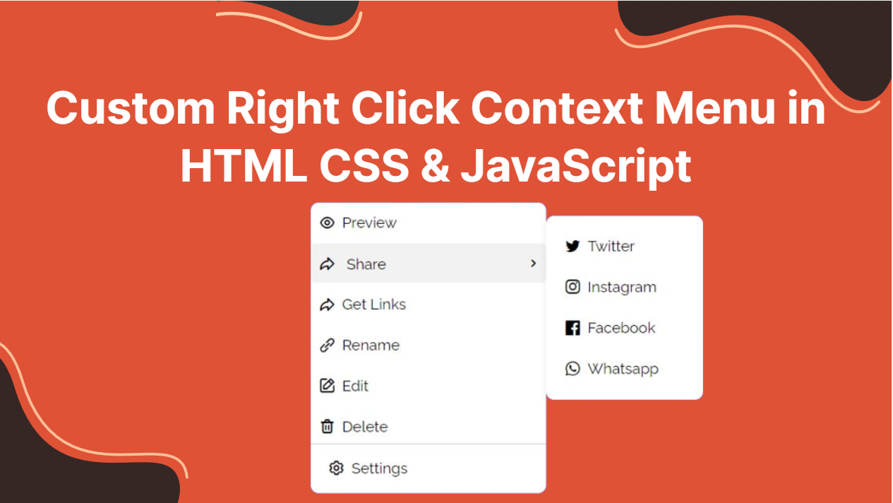
This code creates an unordered list (<ul>) with a class of menu. Within this list, there is one list item (<li>) with a class of item.
Inside the list item, there are two elements: an icon represented by the <i> element and a text label represented by the <span> element. The icon is displayed using the uil and uil-eye classes, which are part of an icon library. The text label “Preview” is contained within the <span> element.
<li class="item share">
                    <div>
                        <i class="uil uil-share"></i>
                        <span>Share</span>
                    </div>
                    <i class="uil uil-angle-right"></i>
                    <ul class="share-menu">
                        <li class="item">
                            <i class="uil uil-twitter"></i>
                            <span>Twitter</span>
                        </li>
                        <li class="item">
                            <i class="uil uil-instagram"></i>
                            <span>Instagram</span>
                        </li>
                        <li class="item">
                            <i class="uil uil-facebook"></i>
                            <span>Facebook</span>
                        </li>
                        <li class="item">
                            <i class="uil uil-whatsapp"></i>
                            <span>Whatsapp</span>
                        </li>
                    </ul>
                </li>
This code creates a list item (<li>) with two classes: item and share. The purpose of these classes may be to allow for custom styling or scripting to be applied to this list item specifically.
Inside the list item, there are three elements: a div element, an icon represented by the <i> element, and a nested unordered list (<ul>) with a class of share-menu. The div element contains the text “Share”, and the icon is represented by the uil-share class.
When the user clicks on the list item, the nested share-menu list is displayed with four list items (<li>). Each list item contains an icon and the name of a social media platform: Twitter, Instagram, Facebook, and Whatsapp. These list items may be used to share the content of the current page on the corresponding social media platform.
Overall, this code demonstrates how HTML elements can be used to create custom menus and user interfaces with nested lists and icons. It also shows how classes can be used to group related elements together and apply custom styles or scripts to those elements.
<li class="item">
                    <i class="uil uil-share"></i>
                    <span>Get Links</span>
                </li>
                <li class="item">
                    <i class="uil uil-link-alt"></i>
                    <span>Rename</span>
                </li>
                <li class="item">
                    <i class="uil uil-edit"></i>
                    <span>Edit</span>
                </li>
                <li class="item">
                    <i class="uil uil-trash-alt"></i>
                    <span>Delete</span>
                </li>
This code creates four list items (<li>) with a class of item. Each list item contains an icon represented by the <i> element and a text label represented by the <span> element.
The first list item has an icon with the uil and uil-share classes, and the text label “Get Links”. The purpose of this item may be to allow users to obtain links for sharing the current content on social media or other platforms.
The second list item has an icon with the uil and uil-link-alt classes, and the text label “Rename”. This item may be used to allow users to change the name or title of the current content.
The third list item has an icon with the uil and uil-edit classes, and the text label “Edit”. This item may be used to allow users to modify the current content, such as editing a document or updating a webpage.
The fourth list item has an icon with the uil and uil-trash-alt classes, and the text label “Delete”. This item may be used to allow users to delete the current content, such as removing a file or deleting a post.
Overall, this code demonstrates how HTML elements can be used to create custom menus and user interfaces with icons and text labels. It also shows how classes can be used to apply custom styles or scripts to related elements.
Finally Our HTML looks like this
<body>
    <div class="wrapper">
        <div class="content">
            <ul class="menu">
                <li class="item">
                    <i class="uil uil-eye"></i>
                    <span>Preview</span>
                </li>
                <li class="item share">
                    <div>
                        <i class="uil uil-share"></i>
                        <span>Share</span>
                    </div>
                    <i class="uil uil-angle-right"></i>
                    <ul class="share-menu">
                        <li class="item">
                            <i class="uil uil-twitter"></i>
                            <span>Twitter</span>
                        </li>
                        <li class="item">
                            <i class="uil uil-instagram"></i>
                            <span>Instagram</span>
                        </li>
                        <li class="item">
                            <i class="uil uil-facebook"></i>
                            <span>Facebook</span>
                        </li>
                        <li class="item">
                            <i class="uil uil-whatsapp"></i>
                            <span>Whatsapp</span>
                        </li>
                    </ul>
                </li>
                <li class="item">
                    <i class="uil uil-share"></i>
                    <span>Get Links</span>
                </li>
                <li class="item">
                    <i class="uil uil-link-alt"></i>
                    <span>Rename</span>
                </li>
                <li class="item">
                    <i class="uil uil-edit"></i>
                    <span>Edit</span>
                </li>
                <li class="item">
                    <i class="uil uil-trash-alt"></i>
                    <span>Delete</span>
                </li>
            </ul>
            <div class="setting">
                <li class="item">
                    <i class="uil uil-setting"></i>
                    <span>Settings</span>
                </li>
            </div>
        </div>
    </div>
</body>
Add below lines in head tag
<link href="https://fonts.googleapis.com/css?family=Lato|Nanum+Gothic:700|Raleway&display=swap" rel="stylesheet">
    <link rel="stylesheet" href="https://unicons.iconscout.com/release/v4.0.0/css/line.css">
This link tag loads the Google Fonts stylesheet into the HTML document. The href attribute specifies the URL of the stylesheet, and the rel attribute indicates the relationship between the current document and the linked resource. In this case, the relationship is a stylesheet.
The Google Fonts stylesheet includes three font families: Lato, Nanum Gothic (700 weight), and Raleway. These fonts can be used to style HTML elements in the document. The display=swap attribute instructs the browser to use a fallback font until the requested font is available, and then swap it in.
This link tag loads the Unicons stylesheet into the HTML document. The rel attribute indicates the relationship between the current document and the linked resource, which is a stylesheet in this case. The href attribute specifies the URL of the stylesheet.
The Unicons stylesheet provides a collection of scalable vector icons that can be used in web development. This stylesheet includes CSS rules for displaying and styling the icons. By linking this stylesheet to the HTML document, developers can use these icons in their web pages without having to create the icons themselves.
Now we are going to add styles to our html as follows
* {
           margin: 0;
           padding: 0;
           box-sizing: border-box;
           font-family: raleway;
       }
The * selector applies the styles to all HTML elements on the page.
The margin and padding properties are set to 0, which removes any default margin or padding that may be applied to elements. The box-sizing property is set to border-box, which includes any border or padding in the element’s total width and height.
The font-family property is set to raleway, which specifies that the font family used for all text on the page is Raleway. This means that all HTML elements on the page will inherit this font unless they are specifically styled otherwise.
By setting these default styles, developers can create a consistent look and feel throughout the entire website. This also helps to ensure that elements are positioned and sized consistently across different browsers and devices.
body {
            /*  display: flex;
            justify-content: center;
            align-items: center; */
            min-height: 100vh;
            background: linear-gradient(135deg, #8b55e9 0%, #5d6be6 100%)
        }
The display property is set to flex, which turns the body element into a flex container. This allows developers to use flexbox to position and align child elements within the body.
The justify-content property is set to center, which centers the child elements horizontally within the body. The align-items property is set to center, which centers the child elements vertically within the body.
The min-height property is set to 100vh, which sets the minimum height of the body to be equal to the viewport height. This ensures that the body takes up the full height of the screen, even if there is no content inside it.
The background property sets the background color of the body to a linear gradient. The gradient starts at the top left corner of the body (135deg angle) with a color of #8b55e9, and ends at the bottom right corner of the body with a color of #5d6be6. This creates a gradient effect from purple to blue across the body element.
By setting these styles for the body element, developers can create a visually appealing and responsive layout for their web pages.
.wrapper {
            position: absolute;
            visibility: hidden;
            width: 300px;
            background-color: #fff;
            border-radius: 10px;
            box-shadow: 0 12px 35px rgba(0, 0, 0, 0.1);
        }
The position property is set to absolute, which positions the element relative to its nearest positioned ancestor. In the absence of any positioned ancestor, it is positioned relative to the initial containing block, which is usually the body element. This allows developers to precisely position the element on the page.
The visibility property is set to hidden, which hides the element from view. The element is not displayed, but it still takes up space on the page.
The width property is set to 300px, which sets the width of the element to 300 pixels.
The background-color property is set to #fff, which sets the background color of the element to white.
The border-radius property is set to 10px, which rounds the corners of the element, giving it a rounded appearance.
The box-shadow property adds a shadow effect to the element. It takes four values: the horizontal and vertical offset of the shadow from the element (0 12px), the amount of blur applied to the shadow (35px), and the color of the shadow (rgba(0, 0, 0, 0.1)). The shadow effect creates a 3D effect, making the element appear to float above the page.
By applying these styles to the .wrapper class, developers can create a stylish and visually appealing container element that can be positioned anywhere on the page.
.wrapper .menu {
            padding: 10px 12px;
        }
The padding property sets the amount of space between the element’s content and its border. The first value sets the top and bottom padding to 10 pixels, while the second value sets the left and right padding to 12 pixels.
By applying this style to the .menu element that is a child of the .wrapper class, developers can add padding to the menu items, making them easier to read and interact with.
.content .item {
            list-style: none;
            font-size: 22px;
            height: 50px;
            border-radius: 5px;
            margin-bottom: 2px;
            display: flex;
            align-items: center;
            padding: 0 5px 0 10px;
            cursor: pointer;
            width: 100%;
        }
list-style: none;: This removes the bullet point that appears by default on list items.font-size: 22px;: Sets the font size of the text inside the.itemelement to 22 pixels.height: 50px;: Sets the height of the.itemelement to 50 pixels.border-radius: 5px;: Sets the border radius of the.itemelement to 5 pixels, giving it rounded corners.margin-bottom: 2px;: Adds a margin of 2 pixels to the bottom of the.itemelement, creating spacing between each item.display: flex;: Sets the display property of the.itemelement toflex, allowing for flexible layout options.align-items: center;: Centers the contents of the.itemelement vertically within the container.padding: 0 5px 0 10px;: Sets the padding of the.itemelement, with 0 padding on the top and bottom, 5 pixels on the right, and 10 pixels on the left.cursor: pointer;: Sets the cursor to a pointer when hovering over the.itemelement, indicating that it is clickable.width: 100%;: Sets the width of the.itemelement to 100% of its container, making it take up the full width available.
.content .item:hover {
            background: #f2f2f2;
        }
This CSS rule applies to any element with the class “item” that is a descendant of an element with the class “content”.
When the user hovers over an element with this class, the background color of the element changes to a light gray color (#f2f2f2). This provides visual feedback to the user that the element is interactive and can be clicked or selected.
The other CSS properties set in this rule define the default styling for elements with this class, including font size, height, border radius, margin, display, alignment, padding, and width. These properties are applied to all elements with the class “item” within the context of an element with the class “content”.
.content .item span {
            font-size: 19px;
            margin-left: 8px;
        }
This CSS rule applies to any span element that is a descendant of an element with the class “item” that is also a descendant of an element with the class “content”.
The rule sets the font size of the span element to 19 pixels and adds an 8 pixel margin to its left side.
The span element is used to display text content within an element with the class “item”. This rule helps to ensure that the text is properly sized and spaced for legibility and visual appeal.
.content .setting {
            display: flex;
            padding: 5px 12px;
            border-top: 1px solid #ccc;
            margin-top: -5px;
        }
This CSS rule applies to any element with the class “setting” that is a descendant of an element with the class “content”.
The rule sets the display property of the “setting” element to flex, which means that its children will be arranged in a row or column, depending on the value of the flex-direction property. The rule also sets the padding of the “setting” element to 5 pixels on the top and bottom and 12 pixels on the left and right. It adds a 1 pixel solid border on the top of the “setting” element with the color #ccc, and sets a negative margin on the top of -5 pixels, which will overlap the top border of the previous element.
This rule is used to create a container element for settings-related content within an element with the class “content”. The styling helps to ensure that the settings container is visually separated from the previous element, and that its content is properly spaced and laid out for easy readability and interaction.
.content .share {
            position: relative;
            justify-content: space-between;
        }
The .content .share selector is used to target a specific element with a class of share that is a child of an element with a class of content.
The properties set for this selector are:
position: relative;– This sets the positioning context for the element as relative to its original position. This allows us to position child elements within this element using absolute or relative positioning.justify-content: space-between;– This aligns the child elements within this element along the main axis, which is horizontal by default, with equal space between them. In this case, it is used to position the child elements on either side of the element.
Overall, these properties allow us to position and align the child elements within this specific element in a desired manner.
.share .share-menu {
            position: absolute;
            background: #fff;
            width: 200px;
            right: -200px;
            top: -35px;
            padding: 13px;
            opacity: 0;
            pointer-events: none;
            border-radius: 10px;
            box-shadow: 0 5px 10px rgba(0, 0, 0, 0.08);
            transition: 0.2s ease;
        }
This CSS code refers to a nested menu element within the HTML structure, specifically for the “Share” button. The “.share .share-menu” selector targets the menu that appears when the “Share” button is clicked. The CSS properties set for this menu include:
- “position: absolute;” – sets the position of the menu relative to its nearest positioned ancestor element (in this case, the “.share” element).
- “background: #fff;” – sets the background color of the menu to white.
- “width: 200px;” – sets the width of the menu to 200 pixels.
- “right: -200px;” – moves the menu 200 pixels to the right, effectively hiding it off the screen.
- “top: -35px;” – moves the menu 35 pixels up, placing it above the “Share” button.
- “padding: 13px;” – adds 13 pixels of padding to the inside of the menu.
- “opacity: 0;” – sets the opacity of the menu to 0, making it invisible.
- “pointer-events: none;” – disables pointer events for the menu, making it unclickable.
- “border-radius: 10px;” – sets the border radius of the menu to 10 pixels, rounding the corners.
- “box-shadow: 0 5px 10px rgba(0, 0, 0, 0.08);” – adds a box shadow to the menu, giving it depth and making it stand out.
- “transition: 0.2s ease;” – adds a smooth transition effect to the menu when it appears, making it more visually appealing.
.share:hover .share-menu {
            opacity: 1;
            pointer-events: auto;
        }
This CSS code sets up a hover effect on an element with class “share”. When the user hovers over an element with class “share”, the CSS selector “.share:hover” applies the following styles to the child element with class “share-menu”:
- “opacity: 1” – this makes the element visible
- “pointer-events: auto” – this allows the user to interact with the element (otherwise, it would be “pointer-events: none” and would not respond to user input)
So, when the user hovers over an element with class “share”, the child element with class “share-menu” will become visible and clickable.
Finally Our CSS File look like as follows
* {
            margin: 0;
            padding: 0;
            box-sizing: border-box;
            font-family: raleway;
        }

        body {
            /*  display: flex;
            justify-content: center;
            align-items: center; */
            min-height: 100vh;
            background: linear-gradient(135deg, #8b55e9 0%, #5d6be6 100%)
        }

        .wrapper {
            position: absolute;
            visibility: hidden;
            width: 300px;
            background-color: #fff;
            border-radius: 10px;
            box-shadow: 0 12px 35px rgba(0, 0, 0, 0.1);
        }

        .wrapper .menu {
            padding: 10px 12px;
        }

        .content .item {
            list-style: none;
            font-size: 22px;
            height: 50px;
            border-radius: 5px;
            margin-bottom: 2px;
            display: flex;
            align-items: center;
            padding: 0 5px 0 10px;
            cursor: pointer;
            width: 100%;
        }

        .content .item:hover {
            background: #f2f2f2;
        }

        .content .item span {
            font-size: 19px;
            margin-left: 8px;
        }

        .content .setting {
            display: flex;
            padding: 5px 12px;
            border-top: 1px solid #ccc;
            margin-top: -5px;
        }

        .content .share {
            position: relative;
            justify-content: space-between;
        }

        .share .share-menu {
            position: absolute;
            background: #fff;
            width: 200px;
            right: -200px;
            top: -35px;
            padding: 13px;
            opacity: 0;
            pointer-events: none;
            border-radius: 10px;
            box-shadow: 0 5px 10px rgba(0, 0, 0, 0.08);
            transition: 0.2s ease;
        }

        .share:hover .share-menu {
            opacity: 1;
            pointer-events: auto;
        }
Now we are going to write js for this project.
const contextMenu = document.querySelector(".wrapper");
   shareMenu = contextMenu.querySelector(".share-menu");
These two lines of code are selecting the HTML elements that are going to be used later in the script.
The first line is selecting an element with the class “wrapper” and storing it in a constant variable called “contextMenu”. This element is most likely the container element for the context menu.
The second line is selecting an element with the class “share-menu” which is a sub-menu within the context menu, and storing it in a constant variable called “shareMenu”. This element is most likely the container element for the sharing options sub-menu.
document.addEventListener("contextmenu", e => { });
This code adds an event listener to the entire document, which waits for the “contextmenu” event to be triggered. The “contextmenu” event is triggered when the user right-clicks on the document, which brings up the browser’s default context menu.
console.log("right Clicked");
        e.preventDefault();
        let x = e.offsetX, y = e.offsetY;
This code logs the message “right Clicked” to the console and prevents the default behavior of the right-click event. It then declares two variables, x and y, and assigns them the values of the horizontal and vertical positions of the mouse cursor within the target element when the right-click event occurred, respectively.
winWidth = window.innerWidth,
            winHeight = window.innerHeight,
            cmWidth = contextMenu.offsetWidth;
        cmHeight = contextMenu.offsetHeight;
In the code, winWidth and winHeight variables are assigned the width and height of the browser window respectively using window.innerWidth and window.innerHeight. Then cmWidth and cmHeight variables are assigned the width and height of the context menu (which is represented by the .wrapper element) using the offsetWidth and offsetHeight properties of the element respectively.
The offsetWidth property returns the width of an element, including the element’s padding and border but not including its margin. The offsetHeight property returns the height of an element, including the element’s padding and border but not including its margin.
if (x > (winWidth - cmWidth - shareMenu.offsetWidth)) {
           shareMenu.style.left = "-200px";
       } else {
           shareMenu.style.left = "";
           shareMenu.style.right = "-200px";
       }
This code is checking if the mouse click’s X position is closer to the right edge of the window than the width of the context menu plus the width of the share menu. If it is, it sets the left position of the share menu to “-200px” to prevent it from going off-screen. Otherwise, it sets the right position of the share menu to “-200px” and leaves the left position as default. This ensures that the share menu will always fit within the visible screen space and will not go off-screen.
x = x > winWidth - cmWidth ? winWidth - cmWidth : x;
        y = y > winHeight - cmHeight ? winHeight - cmHeight : y;
This code is checking if the x-coordinate of the click location is greater than the window width minus the context menu width. If it is, then it sets the x-coordinate to the window width minus the context menu width. This is to ensure that the context menu doesn’t appear offscreen to the right. Similarly, it checks if the y-coordinate is greater than the window height minus the context menu height, and if it is, then it sets the y-coordinate to the window height minus the context menu height. This is to ensure that the context menu doesn’t appear offscreen to the bottom.
contextMenu.style.left = `${x}px`;
        contextMenu.style.top = `${y}px`;
        contextMenu.style.visibility = "visible";
These lines of code set the position of the context menu (wrapper) when the right mouse button is clicked on the webpage. x and y are the coordinates of the mouse click relative to the viewport. winWidth and winHeight represent the width and height of the browser window, respectively. cmWidth and cmHeight represent the width and height of the context menu, respectively.
The code checks whether the context menu would go outside the right boundary of the viewport if positioned at the x-coordinate of the mouse click. If so, it positions the context menu to the left of the mouse click with a left offset of 200 pixels. Otherwise, it positions the context menu to the right of the mouse click with a right offset of 200 pixels.
The code also checks whether the context menu would go outside the bottom boundary of the viewport if positioned at the y-coordinate of the mouse click. If so, it adjusts the y-coordinate of the context menu to prevent it from going outside the bottom of the viewport.
Finally, the code sets the left and top CSS properties of the context menu to the x and y coordinates of the mouse click, respectively, and sets the visibility CSS property of the context menu to “visible”, so that it becomes visible on the webpage.
document.addEventListener("click", () => contextMenu.style.visibility = "hidden");
This code adds an event listener to the document that listens for any click events. When a click event is detected, the function is called, which sets the visibility of the contextMenu element to “hidden”. This allows the context menu to disappear when the user clicks anywhere outside of it.
Finally Our code look like as follows
const contextMenu = document.querySelector(".wrapper");
   shareMenu = contextMenu.querySelector(".share-menu");
   document.addEventListener("contextmenu", e => {
       console.log("right Clicked");
       e.preventDefault();
       let x = e.offsetX, y = e.offsetY;

       winWidth = window.innerWidth,
           winHeight = window.innerHeight,
           cmWidth = contextMenu.offsetWidth;
       cmHeight = contextMenu.offsetHeight;


       if (x > (winWidth - cmWidth - shareMenu.offsetWidth)) {
           shareMenu.style.left = "-200px";
       } else {
           shareMenu.style.left = "";
           shareMenu.style.right = "-200px";
       }


       x = x > winWidth - cmWidth ? winWidth - cmWidth : x;
       y = y > winHeight - cmHeight ? winHeight - cmHeight : y;


       contextMenu.style.left = `${x}px`;
       contextMenu.style.top = `${y}px`;
       contextMenu.style.visibility = "visible";
   });

   document.addEventListener("click", () => contextMenu.style.visibility = "hidden");