You are currently viewing Ionic 6 Hotel / Restorent Managment App UI | Chef Details Page
ionic-6-hotel-restorent-managment-app-ui-order-page

Ionic 6 Hotel / Restorent Managment App UI | Chef Details Page

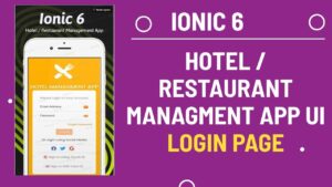
For the Chef Details page in your Ionic 6 Hotel/Restaurant Management App, you can consider the following UI design suggestions:

  1. Header Section: Add a header section on top of the page with a background image of the chef and a profile picture of the chef. You can also add the name of the chef and the type of cuisine they specialize in.
  2. About Chef Section: Create a section where you can provide some information about the chef, such as their experience, qualifications, and achievements. This section can also include some interesting stories or facts about the chef.
  3. Menu Section: Add a section where you can showcase the dishes prepared by the chef. You can add images of the dishes, their names, and brief descriptions. You can also add a price tag for each dish.
  4. Reviews Section: Create a section where users can view the reviews left by previous customers who have eaten the chef’s food. You can also add a rating system to make it easier for users to gauge the quality of the chef’s dishes.
  5. Contact Section: Add a contact section where users can get in touch with the chef to inquire about bookings, catering, or other services. You can include a phone number, email address, or even a contact form for users to fill out.
  6. Social Media Section: Create a section where you can include links to the chef’s social media profiles such as Instagram, Facebook, or Twitter. This can help users follow the chef and keep up-to-date with their latest creations.
  7. Footer Section: Add a footer section with links to other pages of your app such as the home page, about us page, or menu page. You can also include legal information such as terms and conditions, privacy policy, and copyright information.

By incorporating these UI elements into your Chef Details page, you can create a visually appealing and user-friendly interface that will help your customers get to know your chef and their dishes better.

To generate an Ionic 6 page with the name chef-details, you can follow these steps:

  1. Open your terminal or command prompt and navigate to your Ionic project directory.
  2. Run the following command to generate the chef-details page:
ionic generate page chef-details
  1. Once the command is executed, Ionic will create a new directory named chef-details under the src/app directory.
  2. The chef-details directory will contain four files: chef-details.page.html, chef-details.page.scss, chef-details.page.spec.ts, and chef-details.page.ts.
  3. The chef-details.page.html file is the HTML template for the chef-details page, where you can add the UI elements mentioned in my previous answer.
  4. The chef-details.page.scss file is the CSS file for the chef-details page, where you can add custom styles for your UI elements.
  5. The chef-details.page.ts file is the TypeScript file for the chef-details page, where you can add logic for your UI elements.
  6. Once you have added your desired UI elements, you can navigate to the chef-details page in your app by adding the page’s URL to your app’s navigation stack.

That’s it! You have successfully generated an Ionic 6 page with the name chef-details.

Now Open chef-details.page.html page and add following Code as follows

<ion-content>
  <div class="img">
    <div class="top" (click)="home()">
      <div class="back_div">
        <ion-icon name="arrow-back-outline" color="light"></ion-icon>
        <ion-icon name="star-outline" color="light" id="end"></ion-icon>
      </div>
    </div>
</ion-content>

<ion-content> is a container element that provides a scrollable area for the page’s content. It is the main container for the page’s content and should always be included in an Ionic page.

Inside the <ion-content> element, there is a <div> element with a class of "img". This is a custom div element that probably contains an image or some other type of media.

Inside the "img" div, there is another <div> element with a class of "top". This div is the top part of the page and probably contains some navigation elements.

The "top" div has an event listener attached to it with the (click)="home()" attribute. This means that when the user clicks on this element, the home() function in the page’s TypeScript file will be called.

Inside the "top" div, there is another <div> element with a class of "back_div". This div probably contains the back button and some other navigation elements.

Inside the "back_div" div, there are two <ion-icon> elements. These are custom icons provided by the Ionic framework. The first icon has a name of "arrow-back-outline" and a color of "light". This probably represents the back button. The second icon has a name of "star-outline", a color of "light", and an id of "end". This icon probably represents a favorite or bookmark button.

Overall, this code creates a scrollable page with an image and a navigation header at the top. The header contains a back button and a favorite button, and the back button has a click event listener attached to it.

Add Following Code in img class
<div class="bottom">
      <div class="first">
        <img src="../../../assets/001.JPG" />
      </div>
      <div class="second">
        <h4>Patricia Luke</h4>
        <p>Houston Texas</p>
        <p>3.0 <ion-icon name="star-outline" color="light" id="end"></ion-icon> ( 125 Reviews )</p>
      </div>
      <div class="third">
        <h4>$20/Hr</h4>
        <ion-button size="small" color="success">OPEN</ion-button>
      </div>
</div>
 <img id="myimg" src="../../../assets/food/001.JPG" />


<div class="bottom"> is a custom <div> element that probably contains information about the chef, such as their name, location, hourly rate, and a button to open their profile.

Inside the "bottom" div, there is a <div> element with a class of "first". This div probably contains the chef’s profile picture.

Inside the "first" div, there is an <img> element with a src attribute pointing to the location of the chef’s profile picture.

Next, there is another <div> element with a class of "second". This div contains the chef’s name, location, and reviews.

Inside the "second" div, there is an <h4> element containing the chef’s name, a <p> element containing the chef’s location, and another <p> element containing the chef’s rating, represented by an <ion-icon> element with a name of "star-outline", a color of "light", and an id of "end". The number of reviews is also displayed in parentheses.

The third <div> element has a class of "third", and probably contains the chef’s hourly rate and a button to open their profile.

Inside the "third" div, there is an <h4> element containing the chef’s hourly rate and an <ion-button> element with a size of "small" and a color of "success". The button text is “OPEN”.

Finally, there is an <img> element with an id of "myimg", and a src attribute pointing to the location of the chef’s image.

Overall, this code creates a section with information about the chef, including their picture, name, location, rating, hourly rate, and a button to open their profile.

Add Following code after img class
<div claSS="menu">
    <div class="menuDiv">
      <ion-icon name="chatbubble-outline"></ion-icon>
      <p>Message</p>
    </div>
    <div class="menuDiv">
      <ion-icon name="call"></ion-icon>
      <p>Call</p>
    </div>
    <div class="menuDiv">
      <ion-icon name="map-outline"></ion-icon>
      <p>Direction</p>
    </div>
    <div class="menuDiv">
      <ion-icon name="share-outline"></ion-icon>
      <p>Share</p>
    </div>
  </div>


<div class="menu"> is a custom <div> element that probably contains a list of options related to the chef’s profile.

Inside the "menu" div, there are four <div> elements with a class of "menuDiv". Each of these divs probably represents an option that the user can select.

Inside each "menuDiv" div, there is an <ion-icon> element representing an icon, and a <p> element representing the text that appears next to the icon.

The first "menuDiv" element contains an <ion-icon> element with a name of "chatbubble-outline", which probably represents a message option. The adjacent <p> element contains the text “Message”.

The second "menuDiv" element contains an <ion-icon> element with a name of "call", which probably represents a call option. The adjacent <p> element contains the text “Call”.

The third "menuDiv" element contains an <ion-icon> element with a name of "map-outline", which probably represents a direction option. The adjacent <p> element contains the text “Direction”.

The fourth "menuDiv" element contains an <ion-icon> element with a name of "share-outline", which probably represents a share option. The adjacent <p> element contains the text “Share”.

Overall, this code creates a list of options related to the chef’s profile, with icons and text to represent each option. These options probably include the ability to send a message, call the chef, get directions to their location, and share their profile.

<div class="ch-menu">
    <P>Chef Menu</P>
    <div class="wrapper">
      <div class="item" *ngFor="let item of user">
        <img id="img" src="../../../assets/food/{{item.image}}" />
        <p>{{item.title | slice:0:8 }}</p>
      </div>
    </div>
    <ion-segment [value]="segId" (ionChange)="segmentChanged($event)">
      <ion-segment-button value="overview">
        <ion-label>OverView</ion-label>
      </ion-segment-button>
      <ion-segment-button value="services">
        <ion-label>Services</ion-label>
      </ion-segment-button>
      <ion-segment-button value="reviews">
        <ion-label>Reviews</ion-label>
      </ion-segment-button>
    </ion-segment>
  </div>


The <div> element with a class of "ch-menu" contains the chef’s menu.

The <p> element contains the text “Chef Menu”.

The <div> element with a class of "wrapper" contains a list of items that represent the chef’s menu. The items are created using an *ngFor directive, which loops through an array of user objects and creates an <img> element and a <p> element for each object. The src attribute of the <img> element is set dynamically using the {{item.image}} syntax, which uses the value of the image property of each object in the array to construct the path to the corresponding image file in the assets/food/ folder. The <p> element contains the value of the title property of each object, which is sliced to show only the first 8 characters.

The <ion-segment> element creates a segmented control with three segments, each represented by an <ion-segment-button> element. The value attribute of the <ion-segment> element is bound to a segId property, which probably indicates which segment is currently selected. The (ionChange) event is bound to a method called segmentChanged(), which is probably responsible for changing the value of the segId property based on which segment is selected. The <ion-label> element inside each <ion-segment-button> element contains the text that appears inside the segment.

Overall, this code creates a list of menu items, each represented by an image and a title, and a segmented control that allows the user to switch between different sections of the chef’s profile, such as an overview, services offered, and reviews.

<div class="content"></div>
Create a class with name content and add follwoing code.
<div *ngIf="segId == 'overview'" class="overview">
      <ion-grid>
        <ion-row>
          <ion-col size="5">
            <p>About</p>
          </ion-col>
          <ion-col size="7">
            <p class="ion-text-end"><span>Avarage Price : </span><span>$20/</span>Hour</p>
          </ion-col>
        </ion-row>
      </ion-grid>
      <hr>
      <p class="intro">Hi I am Patricia Luke I've always had a passion for cooking. In the day im a Chef for a 5 star
        resturant. Afterwards I use Open Kitchen to share my passions to the world.<span> Read more</span> </p>
      <ion-grid>
        <ion-row>
          <ion-col size="5">
            <p>Hours Available</p>
          </ion-col>
          <ion-col size="7">
            <p class="ion-text-end"><span> </span><span>View Details</span></p>
          </ion-col>
        </ion-row>
      </ion-grid>
      <hr>

      <div class="hrs">
        <ion-label>
          <ion-icon name="ellipse"></ion-icon><span> Monday-Friday : </span>4:00pm - 8:00pm
        </ion-label>
        <br>
        <ion-label>
          <ion-icon name="ellipse"></ion-icon><span> Saturday - Sunday : </span>7:00am - 8:00pm
        </ion-label>
      </div>
      <br>
      <div class="address">
        <h3>Address</h3>

        <ion-label>16704 Bishop Knoll, Houston, Texas 77084, USA</ion-label>

        <h3>Photos <span> View All</span></h3>

        <div class="lower-box">
          <div class="wrapper">
            <div class="item" *ngFor="let item of dish">
              <img id="img" src="../../../assets/food/{{item.image}}" />
            </div>
          </div>
        </div>
        <ion-button expand="block" (click)="goToEvent()">Book a Chef</ion-button>

      </div>
    </div>
  1. <div *ngIf="segId == 'overview'" class="overview">: This creates a div element with a class of “overview” and uses an *ngIf directive to conditionally display the contents of this div based on the value of segId. In this case, the contents of this div will only be displayed if segId is set to “overview”.
  2. <ion-grid>: This creates a grid layout for the content inside the div.
  3. <ion-row>: This creates a row inside the grid.
  4. <ion-col size="5">: This creates a column inside the row with a width of 5 out of 12.
  5. <p>About</p>: This creates a paragraph element with the text “About” inside the column.
  6. <ion-col size="7">: This creates another column inside the row with a width of 7 out of 12.
  7. <p class="ion-text-end"><span>Avarage Price : </span><span>$20/</span>Hour</p>: This creates a paragraph element with two spans that display the text “Average Price : ” and “$20/”, respectively. The paragraph is right-aligned inside the column.
  8. <hr>: This creates a horizontal rule element to separate the sections.
  9. <p class="intro">Hi I am Patricia Luke... </p>: This creates a paragraph element with a class of “intro” that displays a short introduction to the chef.
  10. <ion-grid>: This creates another grid layout.
  11. <ion-row>: This creates another row inside the grid.
  12. <ion-col size="5">: This creates a column inside the row with a width of 5 out of 12.
  13. <p>Hours Available</p>: This creates a paragraph element with the text “Hours Available” inside the column.
  14. <ion-col size="7">: This creates another column inside the row with a width of 7 out of 12.
  15. <p class="ion-text-end"><span> </span><span>View Details</span></p>: This creates a paragraph element with two spans that display an empty space and the text “View Details”, respectively. The paragraph is right-aligned inside the column.
  16. <hr>: This creates another horizontal rule element to separate the sections.
  17. <div class="hrs">: This creates a div element with a class of “hrs” that displays the chef’s available hours.
  18. <ion-label>: This creates a label element.
  19. <ion-icon name="ellipse"></ion-icon><span> Monday-Friday : </span>4:00pm - 8:00pm</ion-label>: This creates an icon element and a span element that display the text “Monday-Friday : ” and “4:00pm – 8:00pm”, respectively. The label wraps the two elements.
  20. <br>: This creates a line break element.
  21. <ion-label>: This creates another label element.
  22. <ion-icon name="ellipse"></ion-icon><span> Saturday - Sunday : </span>7:00am - 8:00pm</ion-label>: This creates another icon element and span element that display the text “Saturday – Sunday : ” and “7:00am – 8:00pm”, respectively. The label wraps the two elements.
  23. <br>: This creates another line break element.

The address section contains the following elements:

  1. An “h3” element with the text “Address”.
  2. An “ion-label” element containing the address information “16704 Bishop Knoll, Houston, Texas 77084, USA”.
  3. An “h3” element with the text “Photos”. It also contains a “span” element with the text “View All”.
  4. A “div” element with the class name “lower-box”. It contains a “wrapper” class and an “item” class. The “item” class is looped through using an *ngFor directive to display a list of images. Each image is displayed using an “img” element with the source set to “../../../assets/food/{{item.image}}”.
  5. An “ion-button” element with the text “Book a Chef”. It has the “expand” attribute set to “block” and a (click) event listener attached to it that calls the “goToEvent()” method.
<div *ngIf="segId == 'services'" class="services">
      <div class="lower-box">
        <div class="wrapper">
          <div class="item" *ngFor="let item of dish">
            <img id="img" src="../../../assets/food/{{item.image}}" />
          </div>
        </div>
      </div>

      <div *ngFor="let order of orders" class="innerService">
        <p id="date">{{order.date}}</p>
        <div class="upperBox1" *ngFor="let Singleorder of order.order">
          <div class="image">
            <img src="../../../assets/food/{{Singleorder.image}}" />
          </div>
          <div class="title">
            <h3>{{Singleorder.title}}</h3>
          </div>
          <div class="menu">
            <h3>
              <ion-icon name="ellipsis-vertical-outline" (click)="presentPopover($event)"></ion-icon>
            </h3>
          </div>
          <div class="orderId">

          </div>
          <div class="amount">
            <h3>${{Singleorder.amount}}</h3>
          </div>
          <div class="status">

          </div>
          <div class="time">
            <p>Est. Time : {{Singleorder.time}}</p>
          </div>
          <div class="edit">
            <button class="btn" type="submit" (click)="presentActionSheet()"> Add</button>
          </div>
        </div>
      </div>
    </div>

his is an HTML template code for a section that will be displayed when segId is equal to services in an Angular application.

The code includes:

  • A div element with a class of services that is displayed when segId is equal to services through the use of an *ngIf directive.
  • A div element with a class of lower-box that contains an image gallery of dishes.
  • A div element with a class of innerService that uses *ngFor to loop through an array of orders, and for each order, display the order date, order details, and estimated time.
  • Inside the innerService div, another div element with a class of upperBox1 uses *ngFor to loop through an array of order objects, and for each order, display the order image, order title, order amount, estimated time, and a button to add more orders.
  • The ion-icon element with a name of ellipsis-vertical-outline is used to display a popover when clicked, and the button element with a class of btn is used to display an action sheet when clicked.

Overall, this section is designed to display a list of orders for a chef’s services, along with an image gallery of dishes. The user can add more orders and view details of each order through the use of popovers and action sheets.

<div *ngIf="segId == 'reviews'" class="reviews">
      <div class="writeReview">
        <p>Write Your Reiviews </p>
        <ngx-stars [color]="'#ffa015'" [size]="2"></ngx-stars>
      </div>

      <div class="imgReview">
        <div class="imgs">
          <img src="../../../assets/001.JPG" />
        </div>
        <div class="inputbox">
          <input type="text" placeholder="Leave Your Experience" />
        </div>
        <div class="empty"></div>
        <div class="btn">
          <ion-button color="danger">POST</ion-button>
        </div>
      </div>

      <div class="comments">
        <ion-label>All Reviews (28)</ion-label>

        <div class="commentBlock">
          <div class="cimg">
            <img src="../../../assets/002.JPG" />
          </div>
          <div class="cName">
            <p>Kevin Doyle</p>
            <ngx-stars [color]="'#ffa015'" [size]="1"></ngx-stars>
          </div>
          <div class="cTime"> 2 days ago</div>
          <div class="star"></div>
          <div class="commentLine"></div>
        </div>
      </div>

    </div>

This is a section of HTML code for a reviews component that displays a form for users to write reviews, a list of existing reviews, and their associated information. Here is a breakdown of the code:

The div container has an *ngIf directive that checks if the segId property is set to ‘reviews’. If true, it displays the reviews section.

Within the reviews section, there are three main sections: write reviews, image reviews, and comments.

The writeReview section contains a paragraph that prompts the user to write their review, followed by a star rating component from a third-party library called ngx-stars. The star rating is used to allow users to rate the restaurant.

The imgReview section contains a container for images, an input box for text, and a post button. This section is used to allow users to add an image along with their review.

The comments section contains a label that displays the total number of reviews, and a commentBlock container that displays a single review along with its associated information such as the reviewer’s name, star rating, time, and comment.

Overall, this code is used to create a user-friendly interface that allows users to write and view reviews of a restaurant, and can be used as part of a larger web application.

Finally Our HTML file looks like

<ion-content>
  <div class="img">
    <div class="top" (click)="home()">
      <div class="back_div">
        <ion-icon name="arrow-back-outline" color="light"></ion-icon>
        <ion-icon name="star-outline" color="light" id="end"></ion-icon>
      </div>
    </div>

    <div class="bottom">
      <div class="first">
        <img src="../../../assets/001.JPG" />
      </div>
      <div class="second">
        <h4>Patricia Luke</h4>
        <p>Houston Texas</p>
        <p>3.0 <ion-icon name="star-outline" color="light" id="end"></ion-icon> ( 125 Reviews )</p>
      </div>
      <div class="third">
        <h4>$20/Hr</h4>
        <ion-button size="small" color="success">OPEN</ion-button>
      </div>
    </div>
    <img id="myimg" src="../../../assets/food/001.JPG" />
  </div>

  <div claSS="menu">
    <div class="menuDiv">
      <ion-icon name="chatbubble-outline"></ion-icon>
      <p>Message</p>
    </div>
    <div class="menuDiv">
      <ion-icon name="call"></ion-icon>
      <p>Call</p>
    </div>
    <div class="menuDiv">
      <ion-icon name="map-outline"></ion-icon>
      <p>Direction</p>
    </div>
    <div class="menuDiv">
      <ion-icon name="share-outline"></ion-icon>
      <p>Share</p>
    </div>
  </div>

  <div class="ch-menu">
    <P>Chef Menu</P>
    <div class="wrapper">
      <div class="item" *ngFor="let item of user">
        <img id="img" src="../../../assets/food/{{item.image}}" />
        <p>{{item.title | slice:0:8 }}</p>
      </div>
    </div>
    <ion-segment [value]="segId" (ionChange)="segmentChanged($event)">
      <ion-segment-button value="overview">
        <ion-label>OverView</ion-label>
      </ion-segment-button>
      <ion-segment-button value="services">
        <ion-label>Services</ion-label>
      </ion-segment-button>
      <ion-segment-button value="reviews">
        <ion-label>Reviews</ion-label>
      </ion-segment-button>
    </ion-segment>
  </div>


  <div class="content">
    <div *ngIf="segId == 'overview'" class="overview">
      <ion-grid>
        <ion-row>
          <ion-col size="5">
            <p>About</p>
          </ion-col>
          <ion-col size="7">
            <p class="ion-text-end"><span>Avarage Price : </span><span>$20/</span>Hour</p>
          </ion-col>
        </ion-row>
      </ion-grid>
      <hr>
      <p class="intro">Hi I am Patricia Luke I've always had a passion for cooking. In the day im a Chef for a 5 star
        resturant. Afterwards I use Open Kitchen to share my passions to the world.<span> Read more</span> </p>
      <ion-grid>
        <ion-row>
          <ion-col size="5">
            <p>Hours Available</p>
          </ion-col>
          <ion-col size="7">
            <p class="ion-text-end"><span> </span><span>View Details</span></p>
          </ion-col>
        </ion-row>
      </ion-grid>
      <hr>

      <div class="hrs">
        <ion-label>
          <ion-icon name="ellipse"></ion-icon><span> Monday-Friday : </span>4:00pm - 8:00pm
        </ion-label>
        <br>
        <ion-label>
          <ion-icon name="ellipse"></ion-icon><span> Saturday - Sunday : </span>7:00am - 8:00pm
        </ion-label>
      </div>
      <br>
      <div class="address">
        <h3>Address</h3>

        <ion-label>16704 Bishop Knoll, Houston, Texas 77084, USA</ion-label>

        <h3>Photos <span> View All</span></h3>

        <div class="lower-box">
          <div class="wrapper">
            <div class="item" *ngFor="let item of dish">
              <img id="img" src="../../../assets/food/{{item.image}}" />
            </div>
          </div>
        </div>
        <ion-button expand="block" (click)="goToEvent()">Book a Chef</ion-button>

      </div>
    </div>


    <div *ngIf="segId == 'services'" class="services">
      <div class="lower-box">
        <div class="wrapper">
          <div class="item" *ngFor="let item of dish">
            <img id="img" src="../../../assets/food/{{item.image}}" />
          </div>
        </div>
      </div>

      <div *ngFor="let order of orders" class="innerService">
        <p id="date">{{order.date}}</p>
        <div class="upperBox1" *ngFor="let Singleorder of order.order">
          <div class="image">
            <img src="../../../assets/food/{{Singleorder.image}}" />
          </div>
          <div class="title">
            <h3>{{Singleorder.title}}</h3>
          </div>
          <div class="menu">
            <h3>
              <ion-icon name="ellipsis-vertical-outline" (click)="presentPopover($event)"></ion-icon>
            </h3>
          </div>
          <div class="orderId">

          </div>
          <div class="amount">
            <h3>${{Singleorder.amount}}</h3>
          </div>
          <div class="status">

          </div>
          <div class="time">
            <p>Est. Time : {{Singleorder.time}}</p>
          </div>
          <div class="edit">
            <button class="btn" type="submit" (click)="presentActionSheet()"> Add</button>
          </div>
        </div>
      </div>
    </div>

    <div *ngIf="segId == 'reviews'" class="reviews">
      <div class="writeReview">
        <p>Write Your Reiviews </p>
        <ngx-stars [color]="'#ffa015'" [size]="2"></ngx-stars>
      </div>

      <div class="imgReview">
        <div class="imgs">
          <img src="../../../assets/001.JPG" />
        </div>
        <div class="inputbox">
          <input type="text" placeholder="Leave Your Experience" />
        </div>
        <div class="empty"></div>
        <div class="btn">
          <ion-button color="danger">POST</ion-button>
        </div>
      </div>

      <div class="comments">
        <ion-label>All Reviews (28)</ion-label>

        <div class="commentBlock">
          <div class="cimg">
            <img src="../../../assets/002.JPG" />
          </div>
          <div class="cName">
            <p>Kevin Doyle</p>
            <ngx-stars [color]="'#ffa015'" [size]="1"></ngx-stars>
          </div>
          <div class="cTime"> 2 days ago</div>
          <div class="star"></div>
          <div class="commentLine"></div>
        </div>
      </div>

    </div>
  </div>

</ion-content>

Now open typrescript file and add following code .

import { Router } from '@angular/router';
import { ActionSheetController, LoadingController, PopoverController } from '@ionic/angular';
import { AppServiceService } from 'src/app/services/app-service.service';
import { OrderPage } from '../popup/order/order.page';

This code imports several modules and components from Angular, Ionic, and the app’s own services and pages:

  1. Router is imported from the @angular/router package, which is used to navigate between pages and pass data between them.
  2. ActionSheetController is imported from the @ionic/angular package, which provides a modal with a set of options to choose from.
  3. LoadingController is imported from the @ionic/angular package, which displays a loading spinner to indicate that the app is busy.
  4. PopoverController is imported from the @ionic/angular package, which provides a modal that floats above the content of the app and can be used to display additional information or options.
  5. AppServiceService is imported from the app’s own services directory, which is used to provide functionality to the app.
  6. OrderPage is imported from the app’s own popup/order directory, which is a custom modal page that allows the user to place an order.
user = [];
  segId = "overview";
  dish = [];
  orders = [];
  heartIcon: string = 'heart-outline';

This code defines four variables: user, segId, dish, orders, and heartIcon.

user is an empty array that will likely hold data about the user.

segId is a string variable that is initially set to "overview". This variable is used to keep track of which tab the user is currently viewing on the page.

dish is an empty array that will likely hold data about the dishes that are available for ordering.

orders is an empty array that will likely hold data about the orders that have been made by the user.

heartIcon is a string variable that is initially set to "heart-outline". This variable is used to store the name of the icon that will be used to represent whether the user has liked a particular dish or not.

constructor(public loadingController: LoadingController,private router : Router,private service: AppServiceService,public popoverController: PopoverController,public actionSheetController: ActionSheetController) { }

This is the constructor of a TypeScript class. It takes in several parameters:

  • loadingController: an instance of the LoadingController class from the Ionic framework. This can be used to display a loading spinner while waiting for data to load or a task to complete.
  • router: an instance of the Router class from the Angular framework. This can be used to navigate between pages in the app.
  • service: an instance of the AppServiceService class. This is a custom service defined in the app that likely provides data and functionality to the component.
  • popoverController: an instance of the PopoverController class from the Ionic framework. This can be used to display a popover menu, such as a context menu or dropdown.
  • actionSheetController: an instance of the ActionSheetController class from the Ionic framework. This can be used to display an action sheet, which is a popover that displays a set of actions for the user to choose from.
ngOnInit() {
   this.presentLoading().then(() => {
     this.service.getAllMenuDishes().subscribe((res) => {
       this.user = res.document.records;
       console.log(this.user);
       
       
     });
     this.service.getAllDishes().subscribe((res) => {
       this.dish = res.document.records;
       console.log(this.dish);
     });

     this.service.getAllOrders().subscribe((res) => {
       this.orders = res.document.records;
       console.log(this.orders);
       this.loadingController.dismiss();
     });
   });
    
 }

In this ngOnInit() method, the component is initializing and calling a few methods.

First, it is calling the presentLoading() method to show a loading spinner on the UI while data is being fetched from the API.

Next, it is calling the getAllMenuDishes() method from the AppServiceService service to get all menu dishes and storing the result in the this.user property. The console.log() statement is logging this data to the console.

Then, it is calling the getAllDishes() method from the AppServiceService service to get all dishes and storing the result in the this.dish property. The console.log() statement is logging this data to the console.

Finally, it is calling the getAllOrders() method from the AppServiceService service to get all orders and storing the result in the this.orders property. The console.log() statement is logging this data to the console. Once the data is fetched, the loading spinner is dismissed using the loadingController.dismiss() method.

goToEvent() {
    this.router.navigate(['/events'])
  }

  segmentChanged(ev) {
    this.segId = ev.detail.value;
    console.log(this.segId);
    
  }

  async presentLoading() {
    const loading = await this.loadingController.create({
      message: "Please Wait .. ",
    });
    await loading.present();
  }

The goToEvent() function is used to navigate to the events page when the “Book a Chef” button is clicked. It calls the navigate() function from the Router module with the destination URL as an argument.

The segmentChanged(ev) function is called when the user changes the selected segment on the page. It takes an event object ev as its argument, and sets the segId property to the value of the selected segment. It then logs the new value of segId to the console.

The presentLoading() function is an async function that shows a loading spinner using the LoadingController module. It creates a new LoadingController instance and calls its create() method with a message as an argument. It then calls the present() method on the resulting LoadingController instance to show the loading spinner.

home() {
   this.router.navigate(['/search-chef']);  
 }

 async presentPopover(ev: any) {
   const popover = await this.popoverController.create({
     component: OrderPage,
     event: ev,
     mode: 'ios',
     translucent: true
   });
   await popover.present();
   const { role } = await popover.onDidDismiss();
 }


This is a method that creates and presents a popover, which is a UI component that displays content in a floating container that appears above the rest of the UI.

The method presentPopover takes an event object ev as input and uses it to position the popover. It first creates a popover using the create method of popoverController and sets its properties such as the component to be displayed (OrderPage), the event that triggered the popover, the mode (ios in this case), and whether it should be translucent.

Then it presents the popover using the present method of popover, which makes the popover visible to the user. Finally, it waits for the popover to be dismissed by calling the onDidDismiss method of popover, which returns a promise that resolves when the popover is dismissed.

async presentActionSheet() {
    const actionSheet = await this.actionSheetController.create({
      header: 'Please Select',
      cssClass: 'my-custom-class',
      mode : "ios",
      buttons: [ {
        text: 'Add to Cart',
        icon: 'cart-outline',
        data: 'Data value',
        handler: () => {
          console.log('Play clicked');
        }
      }, {
        text: 'Add to Favourites',
        icon: 'star-outline',
        handler: () => {
          console.log('Favorite clicked');
        }
      }, {
        text: 'Cancel',
        icon: 'close',
        role: 'cancel',
        handler: () => {
          console.log('Cancel clicked');
        }
      }]
    });
    await actionSheet.present();

    const {  data } = await actionSheet.onDidDismiss();
    console.log('onDidDismiss resolved with role and data',  data);
  }

This is a method that displays an action sheet with three buttons. The presentActionSheet method is async and it awaits the creation of an action sheet using the actionSheetController.create() method. This method takes an object with some configuration properties to customize the appearance of the action sheet.

In this case, the action sheet has a header that says “Please Select”, a custom CSS class called “my-custom-class”, and a mode of ‘ios’ which is specific to the Ionic Framework. The buttons property is an array of objects, each representing a button in the action sheet.

The first button has the text “Add to Cart”, an icon of a shopping cart outline, and a data property with the value of ‘Data value’. When this button is clicked, it logs “Play clicked” to the console. The second button has the text “Add to Favourites”, an icon of a star outline. When this button is clicked, it logs “Favorite clicked” to the console. The third button has the text “Cancel”, an icon of a close icon, and a role of ‘cancel’. When this button is clicked, it logs “Cancel clicked” to the console.

After the action sheet is presented using the await actionSheet.present() method, it waits for the action sheet to be dismissed using the await actionSheet.onDidDismiss() method. When the action sheet is dismissed, it logs the value of the data property of the button that was clicked to the console.

Finally Our typescript file look like as follows

import { Component, OnInit } from '@angular/core';
import { Router } from '@angular/router';
import { ActionSheetController, LoadingController, PopoverController } from '@ionic/angular';
import { AppServiceService } from 'src/app/services/app-service.service';
import { OrderPage } from '../popup/order/order.page';

@Component({
  selector: 'app-chef-details',
  templateUrl: './chef-details.page.html',
  styleUrls: ['./chef-details.page.scss'],
})
export class ChefDetailsPage implements OnInit {
  user = [];
  segId = "overview";
  dish = [];
  orders = [];
  heartIcon: string = 'heart-outline';
  constructor(public loadingController: LoadingController,private router : Router,private service: AppServiceService,public popoverController: PopoverController,public actionSheetController: ActionSheetController) { }


  ngOnInit() {
    this.presentLoading().then(() => {
      this.service.getAllMenuDishes().subscribe((res) => {
        this.user = res.document.records;
        console.log(this.user);
        
        
      });
      this.service.getAllDishes().subscribe((res) => {
        this.dish = res.document.records;
        console.log(this.dish);
      });

      this.service.getAllOrders().subscribe((res) => {
        this.orders = res.document.records;
        console.log(this.orders);
        this.loadingController.dismiss();
      });
    });
     
  }

  goToEvent() {
    this.router.navigate(['/events'])
  }

  segmentChanged(ev) {
    this.segId = ev.detail.value;
    console.log(this.segId);
    
  }

  async presentLoading() {
    const loading = await this.loadingController.create({
      message: "Please Wait .. ",
    });
    await loading.present();
  }

  home() {
    this.router.navigate(['/search-chef']);  
  }

  async presentPopover(ev: any) {
    const popover = await this.popoverController.create({
      component: OrderPage,
      event: ev,
      mode: 'ios',
      translucent: true
    });
    await popover.present();
    const { role } = await popover.onDidDismiss();
  }

  async presentActionSheet() {
    const actionSheet = await this.actionSheetController.create({
      header: 'Please Select',
      cssClass: 'my-custom-class',
      mode : "ios",
      buttons: [ {
        text: 'Add to Cart',
        icon: 'cart-outline',
        data: 'Data value',
        handler: () => {
          console.log('Play clicked');
        }
      }, {
        text: 'Add to Favourites',
        icon: 'star-outline',
        handler: () => {
          console.log('Favorite clicked');
        }
      }, {
        text: 'Cancel',
        icon: 'close',
        role: 'cancel',
        handler: () => {
          console.log('Cancel clicked');
        }
      }]
    });
    await actionSheet.present();

    const {  data } = await actionSheet.onDidDismiss();
    console.log('onDidDismiss resolved with role and data',  data);
  }

  
}

Now Open scss file and add following code

@import url('https://fonts.googleapis.com/css2?family=Poppins:wght@400;600&display=swap');

This line of code imports a font called “Poppins” from the Google Fonts library, which comes in two weights (400 and 600) and will be used in the project. The font will be displayed with a “swap” behavior, which means that it will be displayed using the fallback font initially, and then swap to the Poppins font when it is fully loaded.

ion-content{
    --background:#fff;
    font-family: 'Poppins', sans-serif;
 }

This is a CSS style rule applied to the ion-content element, which is a container for the content of an Ionic page.

The rule sets the custom property --background to a value of #fff, which sets the background color of the ion-content element to white.

The font-family property is set to 'Poppins', sans-serif, which specifies the font to be used for the text inside the ion-content element. The font used is Poppins, which is a sans-serif font.


Add the following code in ion-content as follows .

.img{
        background: black;
        overflow: hidden;
        height:250px;
        width:100%;
        position: relative;
        .top{
            margin-top:40px;
            margin-left:20px;
            margin-right:20px;
            position: absolute;
            width: 100%;
            z-index: 999;
            .back_div{
                font-size: 30px;             
               position: relative;               
                #end{
                   float: right;
                   margin-right:40px;
                }
               
            }
        }

        .bottom{
            bottom:10px;
            left:10px;
            position: absolute;            
            right:10px;
            z-index: 999;
            height:80px;
            display: grid;
            grid-template-columns: 25% 55% 20%;
            grid-template-rows: 80px auto 80px; 
            color:#fff;
            .first{ 
                justify-self: start;               
                img{
                    width:70px;
                    height:70px;
                    border-radius: 50px;
                }
            }

            .second{
                justify-self: start;
                align-self: start;
                h4{
                    margin-top:-3px;
                }
                p{
                    margin-top:-10px;
                }
            }

            .third{
                h4{
                    margin-top:-5px;
                }
            }
        }
        #myimg{
            width:100%;
            object-fit: cover;
            opacity: 0.3;
        }
    }

This code appears to be CSS that styles an image container element. Here is a breakdown of the styles applied:

  • .img: This selector targets the image container element. It sets the background color to black, hides any content that overflows, and sets the height to 250 pixels and the width to 100%. It also sets the position to relative.
  • .top: This selector targets a child element of .img. It sets the margin and position properties, as well as the width and z-index. It also contains a nested .back_div selector.
  • .back_div: This selector targets a child element of .top. It sets the font size and position properties. It also contains a nested #end selector.
  • #end: This selector targets a child element of .back_div. It sets the float and margin properties.
  • .bottom: This selector targets a child element of .img. It sets the position, display, color, and z-index properties, as well as the grid template columns and rows. It also contains nested .first, .second, and .third selectors.
  • .first: This selector targets a child element of .bottom. It sets the justify-self property to start and contains an img selector that sets the width, height, and border-radius properties.
  • .second: This selector targets a child element of .bottom. It sets the justify-self and align-self properties to start and contains h4 and p selectors that adjust the margin properties.
  • .third: This selector targets a child element of .bottom. It contains an h4 selector that adjusts the margin property.
  • #myimg: This selector targets an img element that is a child of .img. It sets the width to 100%, the object-fit property to cover, and the opacity to 0.3.

Overall, this code is used to style an image container element, including a background image and text overlay with some nested elements.

.menu{
        background-color: #f8f8f8;
        width:100%;
        height:auto;
        display: flex;
        justify-content: space-around;
        align-items:center;
        padding-top: 15px;
       
        border-bottom:1px solid #ccc;
        .menuDiv{
            display: flex;
            justify-content: center;
            align-items:center;
            flex-direction: column;
                ion-icon{
                    font-size: 28px;
                    color:red;
                    vertical-align: middle;
                }
            
            
        }
       
        
    }

The code you provided describes the styling for a menu component. The component has a gray background with a border at the bottom that has a light gray color. It’s divided into several menu divs, each containing an icon and a label.

The menu class has the following CSS properties:

  • background-color: #f8f8f8;: Sets the background color of the component to a light gray.
  • width:100%;: Sets the width of the component to 100% of its container.
  • height:auto;: Allows the height of the component to adjust automatically based on its content.
  • display: flex;: Uses flexbox to display the menu divs side by side.
  • justify-content: space-around;: Positions the menu divs with equal space between them.
  • align-items:center;: Centers the menu divs vertically.
  • padding-top: 15px;: Adds a 15px padding to the top of the component.
  • border-bottom:1px solid #ccc;: Adds a bottom border to the component with a light gray color.

The menuDiv class has the following CSS properties:

  • display: flex;: Uses flexbox to display the icon and label vertically.
  • justify-content: center;: Centers the icon and label horizontally.
  • align-items:center;: Centers the icon and label vertically.
  • flex-direction: column;: Displays the icon above the label.

The ion-icon selector has the following CSS properties:

  • font-size: 28px;: Sets the size of the icon to 28 pixels.
  • color:red;: Sets the color of the icon to red.
  • vertical-align: middle;: Vertically aligns the icon with the label.
.ch-menu{
        margin-top:-20px;
        background-color: #f8f8f8;
        width:100%;
        height:200px; 
        
        P{
            margin-left:20px;
            padding-top:20px;
            color:red;
            font-size: 20px;
        }
        .wrapper {
            max-width: 100%;
            border: none;
            display: flex;
            overflow-x: auto;
           
            .item {
                min-width: 100px;
                height: auto;
                position: relative;
                #img {
                    width: 80px;
                    height: 80px;
                    border-radius: 50%;
                    display: block;
                    margin-right: auto;
                    margin-left: auto;
                    border:3px solid #fff;
                    outline: 1px solid red;
                }
                .online {
                    background: green;
                    width: 15px;
                    height: 15px;
                    border-radius: 50%;
                    position: absolute;
                    top: 55px;
                    right: 10px
                }
                p {
                    margin-top: -10px;
                    text-align: center;
                    color:gray;
                    font-size: 14px;
                }
            }
        }
        .wrapper::--webkit-scrollbar {
            width: 0;
        }

        ion-segment{
            --background:#f8f8f8;
            ion-segment-button{
                --indicator-color:#f15b3a;
                --color-checked: #f15b3a;
                font-weight: bold;
            }
            
        }
    }

This is a CSS selector that targets elements with the class name “ch-menu”. The block of code enclosed in the curly braces specifies styling rules for these elements.

  • margin-top: -20px; sets the top margin of the element to -20 pixels, which will move it up 20 pixels relative to its original position.
  • background-color: #f8f8f8; sets the background color of the element to a light gray color with a hex value of #f8f8f8.
  • width: 100%; sets the width of the element to 100% of its parent container.
  • height: 200px; sets the height of the element to 200 pixels.

The <p> element inside the .ch-menu class.

  • margin-left: 20px; sets the left margin of the element to 20 pixels
  • padding-top: 20px; sets the top padding of the element to 20 pixels
  • color: red; sets the text color to red
  • font-size: 20px; sets the font size to 20 pixels

This block of code defines a CSS class called .wrapper. This class contains styling rules for a flex container that is used to display a list of items.

The max-width: 100%; rule specifies that the width of the .wrapper element should be at most 100% of the width of its parent element. The border: none; rule removes the border from the .wrapper element.

The display: flex; rule specifies that the .wrapper element should use flexbox for its layout. The overflow-x: auto; rule specifies that if the content of the .wrapper element is wider than the element itself, a horizontal scrollbar should be displayed.

The .item selector targets the individual items within the .wrapper element. Each item is specified to have a minimum width of 100px, and its height is allowed to be determined by its contents. The position: relative; rule specifies that the position of the item should be relative to its container.

The #img selector targets the image element inside the .item element. The width: 80px; and height: 80px; rules set the dimensions of the image, and the border-radius: 50%; rule creates a circular border for the image. The display: block; rule centers the image within its container, and the border:3px solid #fff; rule creates a white border around the image. The outline: 1px solid red; rule creates a red outline around the image when it is in focus.

The .online selector targets an element that is used to indicate whether the item is currently online. The background: green; rule sets the background color of the element to green. The width: 15px; and height: 15px; rules set the dimensions of the element, and the border-radius: 50%; rule creates a circular shape for the element. The position: absolute; rule specifies that the position of the element should be relative to its nearest positioned ancestor element. The top: 55px; and right: 10px rules position the element in the top right corner of its container.

The p selector targets the paragraph element inside the .item element. The margin-top: -10px; rule creates a negative margin at the top of the element, which overlaps the image element above it. The text-align: center; rule centers the text horizontally within its container, and the color:gray; rule sets the color of the text to gray. The font-size: 14px; rule sets the size of the text to 14 pixels.

This CSS rule is used to customize the scrollbar of the container with the class .wrapper. Specifically, it sets the width of the scrollbar to 0 pixels, effectively hiding it.

The ::--webkit-scrollbar pseudo-element is used to target the scrollbar in WebKit-based browsers like Google Chrome and Safari. Note that this CSS rule is only applicable in WebKit-based browsers, and other browsers may require different CSS rules to achieve the same effect.

The code is defining the style for an ion-segment element.

The --background property sets the background color for the ion-segment element to #f8f8f8.

The ion-segment-button block defines the style for each individual button within the ion-segment. The --indicator-color property sets the color of the indicator for the selected button to #f15b3a. The --color-checked property sets the color of the text and icon for the selected button to #f15b3a. The font-weight property sets the weight of the text for each button to bold.


  .content{
        margin-top:30px;
}

Create a div with class content and add following code as follows.

.overview{
            span:nth-of-type(1){
                color:gray;
            }
            span:nth-of-type(2){
                color:red;
            }
            .intro{
                padding:0px 20px;
                color:gray;
                margin-top: -10px;
                text-align: justify;
                span{
                    color: red;
                }
            }
            .hrs{
                padding-left:10px;
                margin-top:-20px;
                span{
                    color:gray;
                }
                ion-icon{
                    color:rgb(145, 231, 16)
                }
            }

            .address{
                padding-left:10px;
                padding-right:10px;
                padding-bottom:30px;
                ion-label{
                    color:gray;
                }
                h3{
                    color:red;
                    span{
                        float: right;
                        margin-right:10px;
                    }
                }
                .lower-box{
                    .wrapper{
                        max-width: 100%;
                        border:none;
                        display: flex;
                        overflow-x: auto;
        
                        #img{
                            width:100%;
                            height:110px;
                            border-radius: 10px;
                        }
        
                        .item{
                            min-width: 110px;
                            height:110px;
                            line-height:110px;                    
                            margin-right:10px;
                        }
                    }
        
                    .wrapper::--webkit-scrollbar{
                        width:0;
                    }
                }

                ion-button{
                    margin-top:25px;
                    --background: #f15b3a;
                    height:50px;
                }
            }
        }


Print Friendly, PDF & Email

Leave a Reply