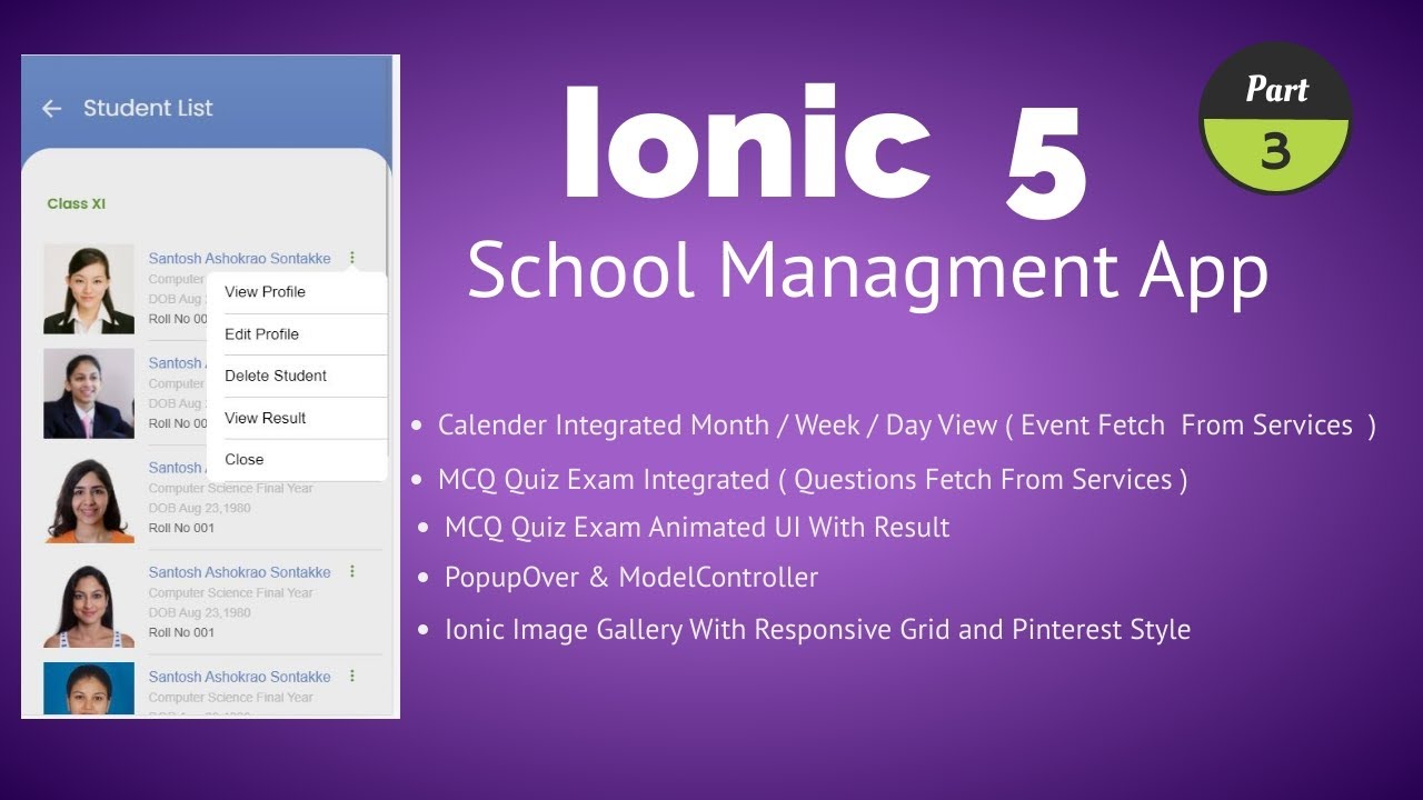
An Ionic 6 School Management app could have a student list feature where a user can view a list of all students in the school. The user can open a student’s information in a dialog window, known as an ion-popover, by clicking on the student’s name. The ion-popover dialog would display additional information about the student, such as their contact details, academic history, and other relevant information. The ion-popover dialog allows the user to view the information without navigating away from the student list page.
To create a new gallery page in Ionic 6, you can follow these steps:
- Generate a new Ionic 6 page using the CLI:
ionic generate page list
- Open the
list.page.htmlfile and add the following code :
<ion-content>
  <div class="top">
    <div class="back_div">
      <ion-icon name="arrow-back-outline" (click)="goBack()" color="light" class="back_btn"></ion-icon>
      <ion-label>Student List</ion-label>
    </div>
  </div>
</ion-content>
The code block you provided is an example of an ion-content component in an Ionic 6 app. The ion-content component is used to define the main content area of an Ionic app.
The code defines a top div within the ion-content component that has a back button and a label. The back button is an ion-icon with the name “arrow-back-outline” and the color “light”. The back button has a click event handler, “goBack(),” which is used to navigate to the previous page.
The ion-label element displays the text “Student List” and indicates the title of the page. The back_div class provides the styling for the back button and the label, including the positioning of the elements within the top div.
<div class="content_div">
    <ion-grid>
      <ion-row>
        <ion-col size = 12>
        </ion-col>
        </ion-row>
    </ion-grid>
</div>
This code defines a block of content in an Ionic 6 application. It uses Ionic UI components to create a grid with a single row and column.
The component <ion-grid> is used to create a responsive grid system for arranging content on the screen. It’s a container component that makes it easy to align content into columns and rows.
The component <ion-row> represents a row within the grid, which can contain multiple columns. The component <ion-col> defines a single column within a row. In this case, the column takes up the entire row, which can be set using the size attribute. The size attribute is set to 12, which means that the column will span 12 columns in the grid. This is the full width of the grid, so the column will take up the entire width of the screen.
In this code, there’s no content within the column, but it can be added as needed.
In ion-col tag add following code.
<ion-list style="overflow-y: scroll !important; height: 100%;">
           <ion-item>
             <ion-thumbnail slot="start" [style.backgroundImage]="'url(/assets/student/1.jpg)'">
             </ion-thumbnail>
             <ion-label>
               <h2>Santosh Ashokrao Sontakke<span style="float: right">
                 <ion-icon name="ellipsis-vertical-outline" (click)="presentPopover($event)"></ion-icon>
                 </span></h2>
               <p id="rate">Computer Science Final Year</p>
               <p id="rate">DOB  Aug 23,1980</p>
               <p>Roll No 001</p>
             </ion-label>
           </ion-item>
   </ion-list>
The element is an “ion-list” with the style attribute setting the overflow-y and height properties. The ion-list contains a single “ion-item” element.
The ion-item element is a list item that has an ion-thumbnail slot in the start position and a style attribute that sets the background image. The ion-label element holds the content of the list item, including a header with the name “Santosh Ashokrao Sontakke” and a right-aligned ellipsis icon for a popover. The ion-label also includes several paragraphs with information about the student, such as their major, date of birth, and roll number.
It’s likely that this code displays a list of students in a mobile app, with each ion-item representing a single student and the information inside the ion-label providing details about that student. The popover triggered by the ellipsis icon may provide additional information or actions related to the student.
Finally Our list.page.html looks like
<ion-content>
  <div class="top">
    <div class="back_div">
      <ion-icon name="arrow-back-outline" (click)="goBack()" color="light" class="back_btn"></ion-icon>
      <ion-label>Student List</ion-label>
    </div>
  </div>

  <div class="content_div">
    <ion-grid>
      <ion-row>
        <ion-col size = 12>
          <p class="lbl">Class XI</p>
          <ion-list style="overflow-y: scroll !important; height: 100%;">
            <ion-item>
              <ion-thumbnail slot="start" [style.backgroundImage]="'url(/assets/student/1.jpg)'">
              </ion-thumbnail>
              <ion-label>
                <h2>Santosh Ashokrao Sontakke<span style="float: right">
                  <ion-icon name="ellipsis-vertical-outline" (click)="presentPopover($event)"></ion-icon>
                  </span></h2>
                <p id="rate">Computer Science Final Year</p>
                <p id="rate">DOB  Aug 23,1980</p>
                <p>Roll No 001</p>
              </ion-label>
            </ion-item>

            <ion-item>
              <ion-thumbnail slot="start" [style.backgroundImage]="'url(/assets/student/2.jpg)'">
              </ion-thumbnail>
              <ion-label>
                <h2>Santosh Ashokrao Sontakke<span style="float: right">
                  <ion-icon name="ellipsis-vertical-outline" (click)="presentPopover($event)"></ion-icon>
                  </span></h2>
                <p id="rate">Computer Science Final Year</p>
                <p id="rate">DOB  Aug 23,1980</p>
                <p>Roll No 001</p>
              </ion-label>
            </ion-item>

            <ion-item>
              <ion-thumbnail slot="start" [style.backgroundImage]="'url(/assets/student/12.jpg)'">
              </ion-thumbnail>
              <ion-label>
                <h2>Santosh Ashokrao Sontakke<span style="float: right">
                  <ion-icon name="ellipsis-vertical-outline" (click)="presentPopover($event)"></ion-icon>
                  </span></h2>
                <p id="rate">Computer Science Final Year</p>
                <p id="rate">DOB  Aug 23,1980</p>
                <p>Roll No 001</p>
              </ion-label>
            </ion-item>

            <ion-item>
              <ion-thumbnail slot="start" [style.backgroundImage]="'url(/assets/student/13.jpg)'">
              </ion-thumbnail>
              <ion-label>
                <h2>Santosh Ashokrao Sontakke<span style="float: right">
                  <ion-icon name="ellipsis-vertical-outline" (click)="presentPopover($event)"></ion-icon>
                  </span></h2>
                <p id="rate">Computer Science Final Year</p>
                <p id="rate">DOB  Aug 23,1980</p>
                <p>Roll No 001</p>
              </ion-label>
            </ion-item>

            <ion-item>
              <ion-thumbnail slot="start" [style.backgroundImage]="'url(/assets/student/14.jpg)'">
              </ion-thumbnail>
              <ion-label>
                <h2>Santosh Ashokrao Sontakke<span style="float: right">
                  <ion-icon name="ellipsis-vertical-outline" (click)="presentPopover($event)"></ion-icon>
                  </span></h2>
                <p id="rate">Computer Science Final Year</p>
                <p id="rate">DOB  Aug 23,1980</p>
                <p>Roll No 001</p>
              </ion-label>
            </ion-item>

            <ion-item>
              <ion-thumbnail slot="start" [style.backgroundImage]="'url(/assets/student/8.jpg)'">
              </ion-thumbnail>
              <ion-label>
                <h2>Santosh Ashokrao Sontakke<span style="float: right">
                  <ion-icon name="ellipsis-vertical-outline" (click)="presentPopover($event)"></ion-icon>
                  </span></h2>
                <p id="rate">Computer Science Final Year</p>
                <p id="rate">DOB  Aug 23,1980</p>
                <p>Roll No 001</p>
              </ion-label>
            </ion-item>

            <ion-item>
              <ion-thumbnail slot="start" [style.backgroundImage]="'url(/assets/student/4.jpg)'">
              </ion-thumbnail>
              <ion-label>
                <h2>Santosh Ashokrao Sontakke<span style="float: right">
                  <ion-icon name="ellipsis-vertical-outline" (click)="presentPopover($event)"></ion-icon>
                  </span></h2>
                <p id="rate">Computer Science Final Year</p>
                <p id="rate">DOB  Aug 23,1980</p>
                <p>Roll No 001</p>
              </ion-label>
            </ion-item>

            <ion-item>
              <ion-thumbnail slot="start" [style.backgroundImage]="'url(/assets/student/10.jpg)'">
              </ion-thumbnail>
              <ion-label>
                <h2>Santosh Ashokrao Sontakke<span style="float: right">
                  <ion-icon name="ellipsis-vertical-outline" (click)="presentPopover($event)"></ion-icon>
                  </span></h2>
                <p id="rate">Computer Science Final Year</p>
                <p id="rate">DOB  Aug 23,1980</p>
                <p>Roll No 001</p>
              </ion-label>
            </ion-item>


          </ion-list>
        </ion-col>


      </ion-row>
    </ion-grid>
  </div>

</ion-content>
Open the list.page.ts file and add an array of image URLs to be displayed:
import { PopoverController } from '@ionic/angular';
import { PopupComponentPage } from '../popup-component/popup-component.page';
This code imports two modules from the @ionic/angular library.
PopoverController is used to create and manage modal popover components in your Ionic app. A popover is a type of dialog that appears on top of an existing view and can be used for various purposes such as displaying a menu, additional content, or to make a form.
PopupComponentPage is a component class that is defined in a separate file called popup-component.page.ts. This component will be used as the content of the popover that is displayed to the user.
The popover is created and displayed to the user when the user clicks on the ellipsis icon (<ion-icon name="ellipsis-vertical-outline" (click)="presentPopover($event)"></ion-icon>). The function presentPopover is called when the icon is clicked and it creates and displays the popover using the PopoverController module.
constructor(private _router: Router,public popoverController: PopoverController) { }
This is a constructor for a class that uses the Ionic framework for building mobile applications. The constructor sets up two dependencies that will be used by the class:
_router: This is an instance of the Angular Router. TheRouteris used to navigate between different routes in an Angular application.popoverController: This is an instance of the IonicPopoverController. ThePopoverControlleris used to create and manage popovers in an Ionic application. Popovers are small dialog boxes that appear on top of the current page and provide additional context or options related to a particular element on the page.
The constructor sets up these dependencies so they can be used throughout the class to provide the desired functionality.
goBack() {
    this._router.navigate(['/home']);
  }
The goBack method is a member function of a class in Angular. It makes use of the Angular Router to navigate the user to a different page or route.
The method takes no parameters. It makes use of the _router member variable, which is an instance of the Router class imported from the @angular/router module. The method calls the navigate method on the _router object, passing an array of strings as an argument.
The array of strings represents the route path to navigate to. In this case, it is ['/home'], which means the user will be navigated to the /home route.
The goBack method can be triggered by an event or when some conditions are met. When it is called, it changes the current route, and the user is redirected to the /home route.
async presentPopover(ev: any) {
   const popover = await this.popoverController.create({
     component: PopupComponentPage,
     event: ev,
     mode: 'ios',
     translucent: true
   });
   await popover.present();
   const { role } = await popover.onDidDismiss();
 }
The presentPopover method is used to present a popover component. A popover is a small floating component that appears on top of the main content and displays additional information related to the main content.
The method takes an event as its input (ev) and uses it to create a new popover component using the create method from the PopoverController class.
It sets the component property of the popover to the PopupComponentPage class and sets the event property to ev, so the popover is displayed at the position of the event.
The mode property is set to ios to specify the mode of the popover, and the translucent property is set to true to indicate that the popover should have a translucent background.
Once the popover has been created, it is presented using the present method. Finally, the onDidDismiss method is used to listen for the dismissal of the popover, and the role property of the returned value is used to determine the cause of the dismissal.
Finally our list.page.ts file look like as
import { Component, OnInit } from '@angular/core';
import { Router } from '@angular/router';
import { PopoverController } from '@ionic/angular';
import { PopupComponentPage } from '../popup-component/popup-component.page';

@Component({
  selector: 'app-student-list',
  templateUrl: './student-list.page.html',
  styleUrls: ['./student-list.page.scss'],
})
export class StudentListPage implements OnInit {

  constructor(private _router: Router,public popoverController: PopoverController) { }

  ngOnInit() {
  }
  goBack() {
    this._router.navigate(['/home']);
  }


  async presentPopover(ev: any) {
    const popover = await this.popoverController.create({
      component: PopupComponentPage,
      event: ev,
      mode: 'ios',
      translucent: true
    });
    await popover.present();
    const { role } = await popover.onDidDismiss();
  }
}
Now open list.page.scss file for styling , add following code as follows
@import url('https://fonts.googleapis.com/css2?family=Poppins:wght@400;600&display=swap');
The line of code “@import url(‘https://fonts.googleapis.com/css2?family=Poppins:wght@400;600&display=swap‘);” is a CSS import statement that is used to import a specific font from Google Fonts into a web page.
The font being imported is “Poppins” with font weight “400” and “600”. The CSS import statement is used to load the font into the page so that it can be applied to elements within the HTML document.
The “display=swap” part of the URL specifies that the font should be displayed in a swapable format, meaning that if the font is not available on the user’s device, it will be replaced with a default font. This helps ensure that the text on the page is always legible, even if the user doesn’t have the specified font installed.
ion-content{
    font-family: 'Poppins', sans-serif;
    --background:linear-gradient(#7292cf,#2855ae );

    }
The CSS code above sets the font family of the text within the “ion-content” HTML element to “Poppins”. The font is imported from the Google Fonts API with the line “@import url(‘https://fonts.googleapis.com/css2?family=Poppins:wght@400;600&display=swap‘);”.
The “–background” property sets the background color of the “ion-content” element to a linear gradient with two colors: “#7292cf” and “#2855ae”. The gradient starts with the first color and gradually transitions to the second color.
.top{
        display: flex;
        justify-content: space-between;
        align-items:center;
        margin-top:40px;
        margin-left:20px;
        margin-right:20px;
        .back_div{
            font-size: 30px;
            display: flex;
            justify-content: space-between;
            align-items:center;
            ion-label{
                color:#fff;
                font-size:25px;
                padding-left:20px;
            }
        }
    }
This is a CSS class named .top which styles a block-level element. The CSS properties specified in this class do the following:
display: flexmakes the element a flex container and causes its direct children to be laid out along a main axis and a cross axis.justify-content: space-betweenaligns the direct children along the main axis so that the first child is flush against the start of the main axis and the last child is flush against the end of the main axis, while all other children are spaced evenly between them.align-items: centeraligns the direct children along the cross axis so that they are vertically centered within the flex container.margin-top: 40px; margin-left: 20px; margin-right: 20px;adds a top margin of 40 pixels, a left margin of 20 pixels, and a right margin of 20 pixels to the element, creating space outside the element.
There is another class .back_div defined within the .top class. It specifies the following styles:
font-size: 30pxsets the font size of the element to 30 pixels.display: flexmakes the element a flex container and causes its direct children to be laid out along a main axis and a cross axis.justify-content: space-betweenaligns the direct children along the main axis so that the first child is flush against the start of the main axis and the last child is flush against the end of the main axis, while all other children are spaced evenly between them.align-items: centeraligns the direct children along the cross axis so that they are vertically centered within the flex container.
There is an ion-label element within the .back_div class which is styled as follows:
color: #fffsets the text color to white.font-size: 25pxsets the font size to 25 pixels.padding-left: 20pxadds a left padding of 20 pixels to the element, creating space inside the element.